From the 1920s, Monotype took the challenge of improving typography very seriously and embarked on a programme of developing new faces and reviving classic faces so that the world might be rid of faces like Cheltenham. Intertype and Linotype were slow to follow and concentrated on speed of production rather than quality. My view is that Ludlow took typography seriously, but their smaller market share meant they didn’t have the same impact.
The system itself had some advantages as well as the italics (mentioned below), the same degree of control was available over spacing as in hand composition. Contrast this with linecasters using adjustable spaces that sometimes led to rivers of spaces following through work.
The name R. Hunter Middleton is synonymous with the Ludlow Corporation, and he designed some of the firm’s most successful faces including Deplhian Titling, Tempo (sans serif), Karnak (slab serif), and a Garamond
Italics

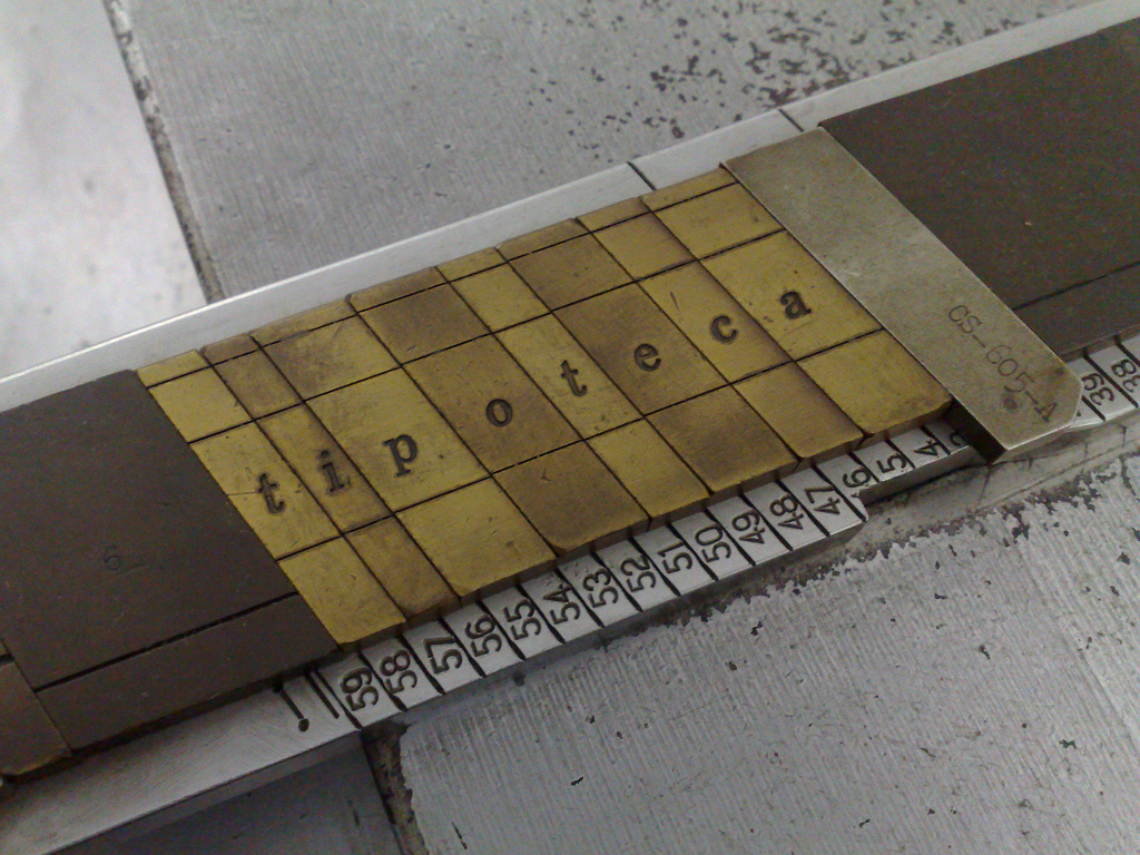
Because of the simplicity of the Ludlow system, they could make amendments to the operation of the machine relatively easily. Once such change was to introduce italic matrices, and a special italic stick. A difficult problem for line-casting is that italics have a tendency to encroach on the area of the preceding and following letters: take the f for example, which will hang under the earlier character and over the following. Because most other casting uses rectangular mats, this cannot easily be accounted for and so the face has to be adjusted and weakened to fit within the confines of the mat. In 1913 Ludlow decided to go with the italic wholeheartedly and developed matrices that slope at a 17° angle and are held in a stick with ends at the same angle. The result is that an f, for example, can be cast at that angle and fit neatly with the other types at the same angle. By means of triangular spaces, roman and italics can mix on the same line.
Ludlow took full advantage of this and developed some beautiful italics to go with their faces.
Ruleform
Knowing that they were keen to attract the jobbing printer, Ludlow set out to make the printing of ruled formes very easy. Jobbing printers had to produce invoices, bills, account sheets and so on, and traditionally had used metal rules sat between lead types to create the right pattern. This approach tied up material and took a vast amount of time: imagine setting multiple horizontal and vertical rules with some type to create a petrol station receipt, for example.
Mr Merrill of Ludlow developed Ruleform in 1923. The approach was to create uniform-width matrices and exploit the slug by casting overhangs and underhangs at the top and bottom of the same slug. Using the repeat casting function meant that one line could be set and duplicated, and the underhangs and overhangs would mesh with each other to create a whole, solid lump for printing.
