Despite Covid restrictions, the letterpress champions at St Bride are organising a virtual wayzgoose. Details below!
Due to the ongoing coronavirus restrictions in the UK, we have decided to host a virtual wayzgoose on Sunday 11 July from 10am–1pm BST online via the St Bride Foundation Twitter and Instagram accounts.
https://twitter.com/stbridelibrary
https://www.instagram.com/stbridefoundation
We are inviting letterpress practitioners, printers, and associated trades to share their wares with us on the day using the #SBFWayzgoose.
All you will need to do is create an Instagram/Twitter post between 10–1pm BST on the 11 July sharing:
- A photograph/s of your work
- A link to your website/work/online shop
- A short description of who you are and what you do
- Include the #SBFWayzgoose
- And tag us in the post using @stbridelibrary for Twitter and @stbridefoundation for Instagram
We will then promote anyone’s work/business who joins in on the day as long as the work being shared is appropriate and adheres to the above guidelines.
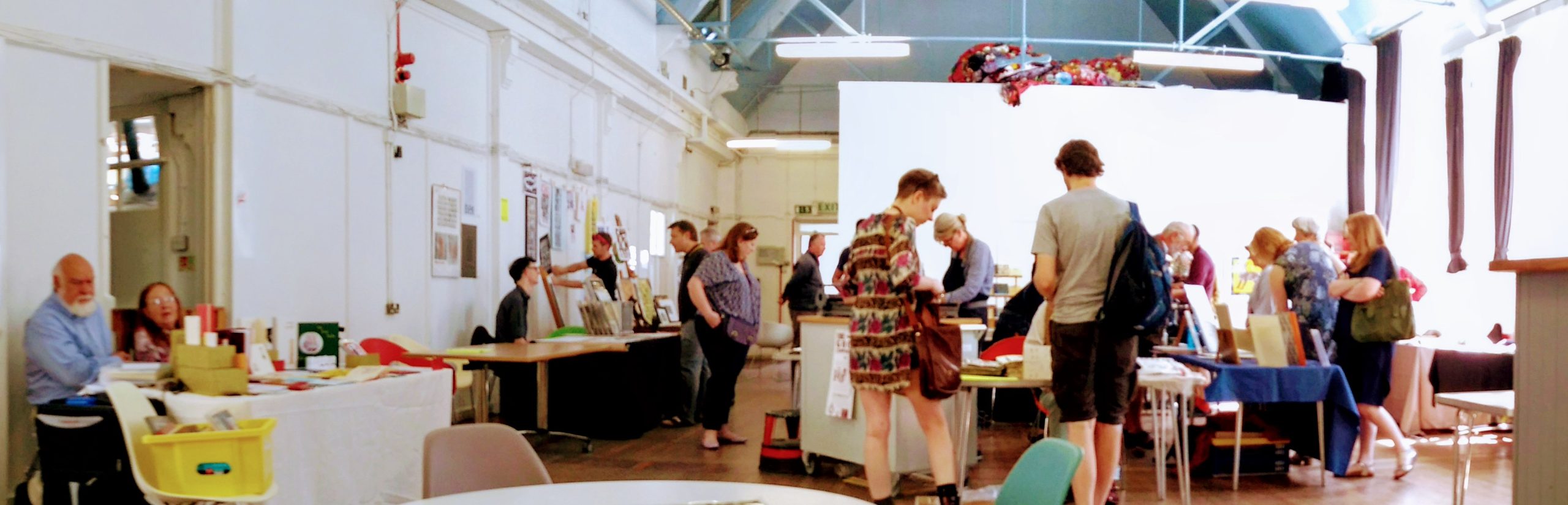
Our aim is to celebrate the fantastic wealth of creativity, trade and craft within the letterpress and printing communities around the globe, with the St Bride Library and Print Workshop championing them at its heart.
This is free – no costs are needed to take part and it is open to all. Please share this with anyone you think would be interested in taking part.
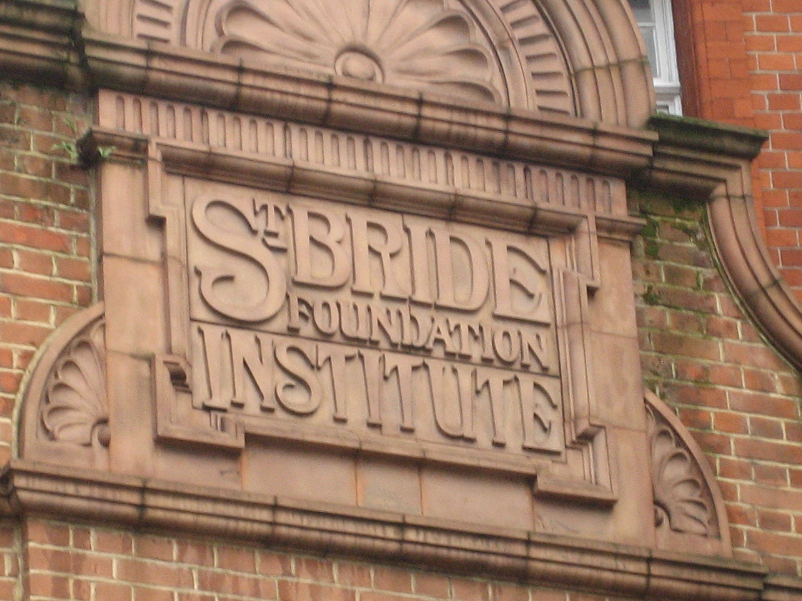
Header Image: “St Bride Foundation Institute” flickr photo by HowardLake https://flickr.com/photos/howardlake/3746315607 shared under a Creative Commons (BY-SA) license


