Tag: Monotype

  • Curwen Press

    Curwen Press

    John Curwen and the Tonic sol-fa system
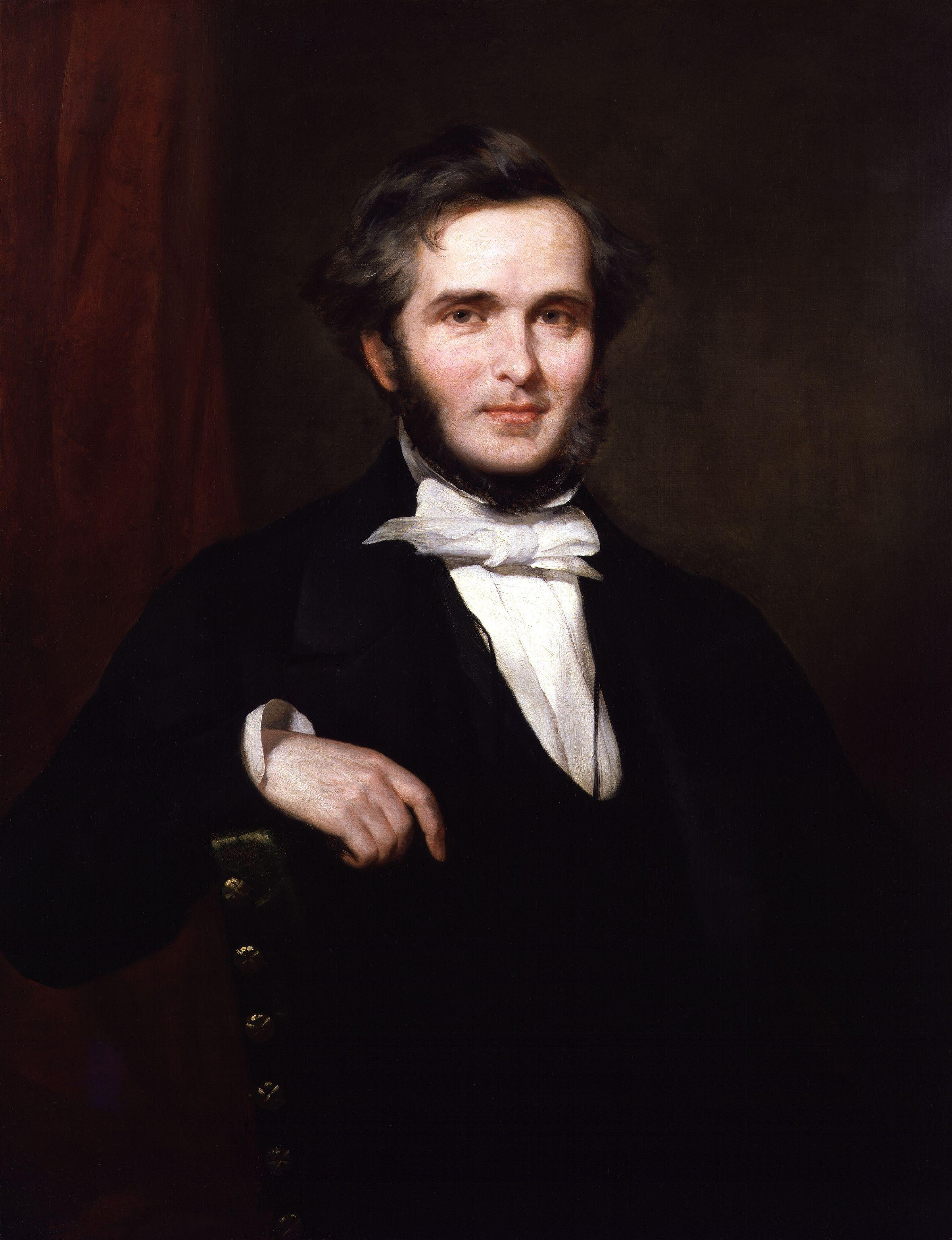
    John Cur­wen by William Gush, shared as pub­lic domain.

    John Cur­wen was born in Liv­ersedge, West York­shire in late 1816. Fol­low­ing John Wes­ley’s exam­ple, John was a non­con­formist min­is­ter and was keen to alle­vi­ate the worst of the con­di­tions in which he found his flock.

    John Cur­wen was con­vinced that one relief for those he looked after was music. In the days before any record­ings and with lim­it­ed gen­er­al under­stand­ing of musi­cal nota­tion, it was dif­fi­cult to share musi­cal works between choirs and con­gre­ga­tions.

    John met Sarah Ann Glover, who had invent­ed and per­fect­ed a tech­nique to doc­u­ment and teach music, her Nor­wich sol-fa Lad­der. Cur­wen saw the oppor­tu­ni­ty to pop­u­larise Glover’s method to share more broad­ly the joy that came from music.

    https://www.flickr.com/photos/internetarchivebookimages/14779827451/in/photolist-aF5oiF-QgdvNn-ormtts-64XwBN-6og1kU-ow3tMe-oewW6E-2W49qB-oweZC7-ows4Dv-2W4cFM-a5Qyab-VuVaeM-Qvr3iK-DimyW-a5QyAh-owaZSR-owb62D-DimwV-ows5ZM-oeGNc4-oeGULA-Dimxc-eN3FB3-4sGMAq-EoX3pP-EoWYfM-qew39t-e5LeZk-TqV6kE-UtQRqW-8GqkE6-pexJZf-TqV6pY-eMPB8r-yXai-ovWxpM-DimxZ-61JRVv-4GJFgG-ouqdAf-eN3Qqj-eN3Tpf-DimA6-oX5zkx-2hhYPWD-DKVUJX-owf255-eN41wh-eN4faC
    Ton­ic sol-fa and Stan­dard Musi­cal Nota­tion shown togeth­er, embed­ded from Flickr.

    In 1841 John Cur­wen was giv­en a mis­sion by the Con­fer­ence of non­con­formist Sun­day School teach­ers in Hull. His task was to cul­ti­vate singing through­out the move­ment. His base was Plais­tow, at that stage a devel­op­ment on the route out of Lon­don to Essex.

    Curwen Press and Music Printing

    Print­ing Ton­ic sol-fa was far less com­plex than print­ing tra­di­tion­al music nota­tion, but still fid­dly — need­ing spe­cial spac­ing and char­ac­ters. John Cur­wen’s mis­sion was threat­ened when exist­ing print­ers were less than keen to print his Ton­ic sol-fa works for rea­son­able prices.

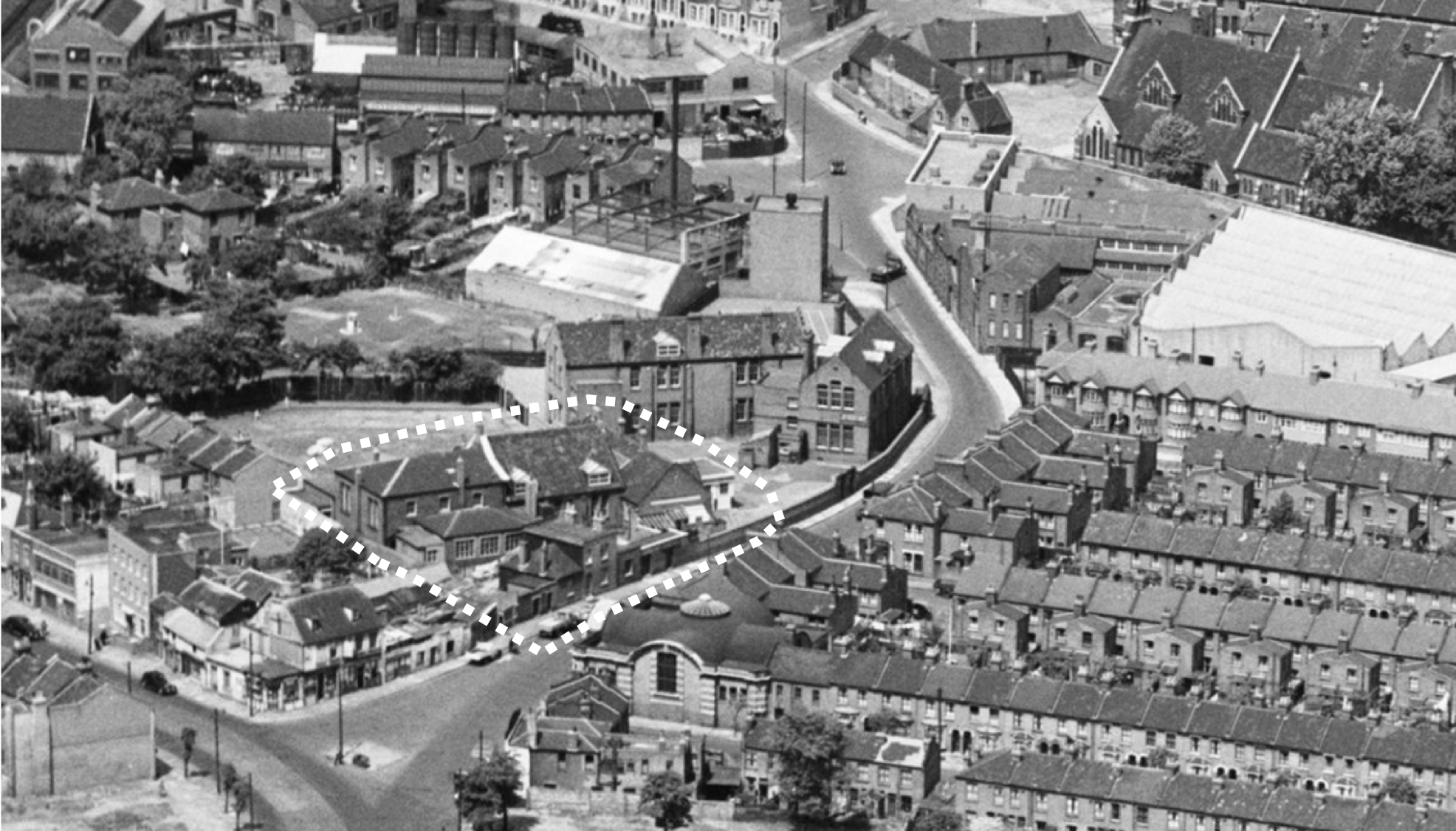
    In 1863 John devel­oped his own print­ing works to print this music ini­tial­ly in a cot­tage next to John’s chapel in North Street, Plais­tow.

    Cur­wen Press, cen­tre, from Britain from Above, https://www.britainfromabove.org.uk/en/image/EAW043562, © His­toric Eng­land

    For a long peri­od the press was a sub­sidiary of the Ton­ic sol-fa move­ment. The press exist­ed only to print — as cheap­ly as pos­si­ble — Ton­ic sol-fa music in huge vol­umes to make good on the mis­sion John had been giv­en in 1841. Job­bing work was car­ried out as a sec­ondary con­cern.

    The enter­prise — includ­ing press and music pub­lish­ing — passed from John to his two sons John Spencer Cur­wen and Joseph Sped­ding Cur­wen on John’s death in 1880.

    Harold Spedding Curwen

    Joseph Cur­wen’s youngest son, Harold Sped­ding Cur­wen, had been edu­cat­ed in print­ing and let­ter­ing. He stud­ied under Edward John­ston at the Cen­tral School, and spent time in Ger­many with Oscar Brand­stet­ter at Leipzig. In 1914 John Spencer Cur­wen appoint­ed Harold as the man­ag­er of the press.

    Harold sought to use his appre­ci­a­tion for type and let­ter­ing, and his mem­ber­ship of the Coun­cil of the Design and Indus­tries Asso­ci­a­tion, to bring more joy to his print­ing work.

    This was­n’t always appre­ci­at­ed and West Ham Cor­po­ra­tion Tramways closed their account with the Cur­wen Press when their orders were received in Caslon rather than their usu­al­ly expect­ed weak­er types. They con­sid­ered their con­tract with Cur­wen had been breached!

    In 1915 the short­age of lead for the war effort gave Harold a great oppor­tu­ni­ty — he was able to sell, above book val­ue, the accu­mu­lat­ed years of lead type and replace them with a small­er num­ber of more refined faces. In this peri­od from 1915 Cur­wen’s main faces were –

    • Caslon Old Face, Mono­type Old Style № 2, Mod­ern Wide № 18, Bold № 53 and Mono­type Imprint (pre­sum­ably for Mono­type com­po­si­tion)
    • Goudy Ken­ner­ley and Shank’s Plan­tin for hand com­po­si­tion

    Joseph Thorp and Oliver Simon

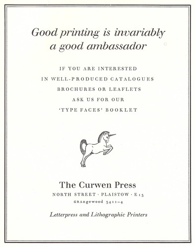
    "Good Printing", advert for the Curwen Press - 1956
    Cur­wen advert with Eric Gill’s Uni­corn, embed­ded from Flickr

    Harold Cur­wen appoint­ed Joseph Thorp as con­sul­tant to the press in 1918 who sug­gest­ed the press adopt a mark. It was the uni­corn that was select­ed and over the years many dis­tin­guished crafts­men have giv­en their own inter­pre­ta­tion of this mark. The mark is designed to embody ​‘pride, puri­ty, endurance and match­less spir­it’.

    Thorp was able to head on the road to sell Cur­wen’s print­ing as Harold found a voice for the press. Harold issued adverts invit­ing cus­tomers to ​‘Get the spir­it of joy in your print­ed things’, and offered that ​‘I arrange and make COURAGEOUS PRINTING’.

    Oliv­er Simon​’s appoint­ment in 1920 as a trainee gave fur­ther strength to the artis­tic changes of the Press as it moved from the side-busi­ness of a music pub­lish­er to a well-recog­nised print­ing house. It was Oliv­er Simon that led The Fleu­ron which was print­ed on some occa­sions by the Cur­wen Press.

    Music and Printing Split

    As the qual­i­ty and sta­tus of print­ing work grew, the bonds between the music pub­lish­ing and print­ing side of the busi­ness weak­ened — one was no longer com­plete­ly depen­dant on the oth­er.

    In 1933 the Cur­wen firm was for­mal­ly split: J Cur­wen & Sons became the music pub­lish­er, which ran until 1969; and Cur­wen Press Ltd. was the name of the print­er.

    Quality Jobbing Work

    The focus moved from music to more gen­er­al print­ing, and key to offer­ing excel­lent job­bing work was to bring the stan­dards of book print­ing to job­bing work. Cur­wen sought to offer the same qual­i­ty in the small­est, ephemer­al work as the largest and most pres­ti­gious books.

    Between 1923 and 1925 Cur­wen adopt­ed Max­imil­lian, Rudolf Koch’s Kur­siv and Wal­baum. Wal­baum remained exclu­sive to Cur­wen in the UK until 1933 when Mono­type began to offer Wal­baum on their cast­ing sys­tem.

    World War II

    Cur­wen’s loca­tion in Plais­tow was less than two miles from the Luft­waffe tar­gets of Lon­don’s dock­lands. The press was dam­aged severe­ly dur­ing the Blitz, but work car­ried on as usu­al, with roof­ing tem­porar­i­ly repaired, and tea pro­vid­ed whether gas and water were still work­ing or not. Unfor­tu­nate­ly a large amount of Cur­wen’s orig­i­nal music print­ing plates were destroyed by ene­my action. John Cur­wen’s orig­i­nal chapel, with it’s thick walls, remained stand­ing.

    Typography for Hospitality

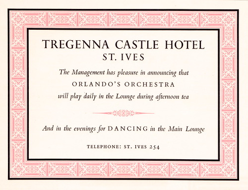
    British Transport Commission - Tregenna Castle Hotel, St. Ives, Cornwall - information card for Orlando's Orchestra, c1955
    Cur­wen-print­ed ephemera for the British Trans­port Com­mis­sion, embed­ded from Flickr, uploaded by Mikey Ash­worth

    Charles Mayo was appoint­ed design­er to the British Trans­port Com­mis­sion in 1954 and sought to raise the stan­dard of rail­way print­ing. He patro­n­ised the Cur­wen Press and found a part­ner in the press that devot­ed effort to great print­ing; could use let­ter­press to best advan­tage; and gave a dis­tinc­tive style to their print­ing.

    Montfort Restaurant, Charing Cross Hotel, London WC2 : menu card : 1967 : British Transport Hotels : printed at Curwen Press
    Cur­wen-print­ed ephemera for the British Trans­port Com­mis­sion, embed­ded from Flickr, uploaded by Mikey Ash­worth

    Cur­wen’s Bert Smith was a huge­ly skilled com­pos­i­tor with a flair for mak­ing great use of Mono­type­’s increas­ing out­put of well-designed bor­der units. Smith’s style was the sub­ject of a 1958 Mono­type Recorder, Typog­ra­phy for Hos­pi­tal­i­ty, which is avail­able on the Met­al Type web­site. That num­ber of the Recorder was print­ed by the Cur­wen Press.

    Bert Smith retired from Cur­wen Press in 1964 and died in Novem­ber 1983. The style con­tin­ued after Smith’s retire­ment, and the exam­ple here is from 1967.

    The 1960s and Beyond

    Cur­wen Press, Plais­tow. Inte­ri­or of for­mer North Street Chapel. May 1970. ©Newham Coun­cil

    By 1965 a rein­vig­o­rat­ed Board decid­ed to go for high­er lev­els of out­put to keep the fir­m’s stan­dards high and fund the new machin­ery and equip­ment to stay cur­rent. Four-colour off­set machin­ery was installed in 1965 and this was part­nered with a small firm — Harleyprint — that Cur­wen had bought in August 1964.

    It is scarce­ly exag­ger­at­ing to say that, for the Cur­wen Press at that time, let­ter­press rep­re­sent­ed the only true faith and that off­set print­ing, although lith­o­g­ra­phy had been prac­tised at Plais­tow for longer than in most print­ing firms, was not of a sim­i­lar stand­ing.

    – Basil Harley, quot­ed in the Pen­rose Annu­al 1978

    Cur­wen found itself with around 250 employ­ees and ambi­tions to achieve the same high stan­dards in colour litho as it was famous for in let­ter­press. The firm was well-con­nect­ed with the spec­trum of British indus­try and estab­lish­ment: work for HMSO, the Inde­pen­dent Tele­vi­sion Author­i­ty, Rio Tin­to and UNICEF was all car­ried out. Work ranged from ephemera to the finest repro­duc­tion of artis­tic vol­umes.

    Closure

    Accord­ing to most of my papers, Cur­wen Press closed in 1984. The Gazette records that liq­uida­tors were appoint­ed in August 1985. Hap­pi­ly, many of the let­ter­press arte­facts lived on through small­er let­ter­press print­ers. Ian Mor­timer still uses the amaz­ing fur­ni­ture and racks from the press, and Alan Brignull uses a case of Caslon from 1957.


    Year and Era

    1863 / Com­mer­cial

    Object Type

    Firms and Organ­i­sa­tions

    Location

    St Mary’s Road, Plais­tow, Lon­don


    Sources and More Information

    • Simon, Her­bert, Song and Words: A His­to­ry of the Cur­wen Press, 1973
    • Harley, Basil, The Cur­wen Press, a Short His­to­ry, 1970
    • Richard­son, Bob, Small Print­er: Inter­na­tion­al Man of Mys­tery, 2021

    An Appeal

    If you have some­thing linked to this object, please get in touch.


    ““The Plais­tow Wall­pa­pers”, designed by Edward Baw­den & issued by the Cur­wen Press — advert in Design Mag­a­zine, 1934” flickr pho­to by mikeyash­worth https://flickr.com/photos/36844288@N00/4451282107 shared under a Cre­ative Com­mons (BY-NC-ND) license

  • Bembo

    Bembo

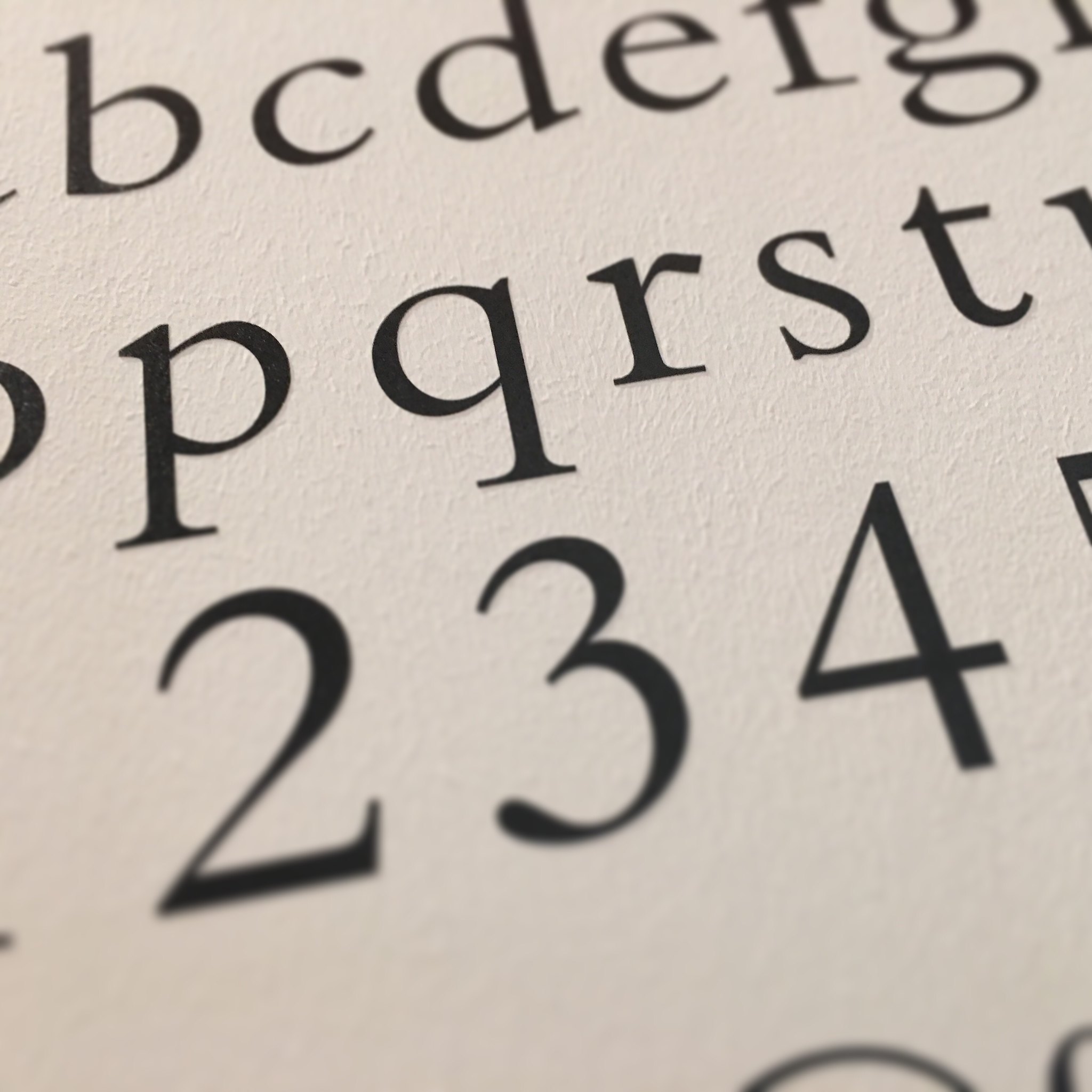
    As a face, Bem­bo has that look that it’s been around for­ev­er. In fact it’s a 1929 face cre­at­ed by Mono­type with impec­ca­ble cre­den­tials.

    Monotype’s Work

    Stan­ley Mori­son was attract­ed to 15th Cen­tu­ry Ital­ian print­ing, and cor­re­spond­ed with print­er Gio­van­ni Marder­steig. Oth­er forces came togeth­er at the same time: a reac­tion away from the ​‘mod­ern’ faces that had been dom­i­nant in job­bing print­ing, improved cast­ing process­es through the Mono­type sys­tem, and bet­ter print­ing sur­faces.

    …inspired not by writ­ing, but by engrav­ing; not script but sculp­ture.

    Stan­ley Mori­son on Bem­bo Roman, quot­ed in a New York Times let­ter.

    Bem­bo was reviewed in The Fleu­ron in 1930, com­ment­ing ​“It will be used by the ​‘undis­tin­guished’ as well as the dis­tin­guished print­er, for it pos­sess­es all the virtues in an emi­nent degree; a first-class leg­i­bil­i­ty in its own right, an Eng­lish­ness con­ferred by our use of Caslon for two cen­turies, econ­o­my in a‑z space, ade­quate but not extrav­a­gant ascen­ders and descen­ders, agree­able vari­ety thicks and thins, a per­fect grace in com­bi­na­tion and, above all, a due capac­i­ty for enlarge­ment.”

    This com­ment on ​‘undis­tin­guished’ print­ers prob­a­bly relates to the over­all pop­u­lar­i­ty with small job­bing print­ers pro­duc­ing sin­gle-page work as well as book print­ers. Print In Britain rec­om­mend­ed Bem­bo as a core face for what they called Class C Print­ers — those tak­ing on mul­ti-colour and more ambi­tious job­bing work.

    Mono­type­’s work was painstak­ing, and the over­all approach was to cut and tri­al select­ed char­ac­ters mak­ing sure the over­all impres­sion was right before com­mit­ting to the full set of char­ac­ters for the matrix. A ref­er­ence in the Jour­nal of the Print­ing His­tor­i­cal Soci­ety (2001) sug­gests this was an iter­a­tive process and Mono­type­’s works in Sur­rey would re-make the punch­es over and over again until the results were sat­is­fac­to­ry.

    The com­pan­ion ital­ic to what was now Mono­type Series 270 was ini­tial­ly designed by Alfred Fair­bank, but it was found this ital­ic did not har­monise well with the roman face. The even­tu­al ital­ic was based on the cal­li­graph­ic writ­ing of Tagliente.

    Historical Basis

    The face was ini­tial­ly cut by Francesco Grif­fo, a punch­cut­ter — a key stage in cre­at­ing type — from Bologna, Italy. This was used by the Venet­ian print­er Aldus Manu­tius for a book by Pietro Bem­bo in 1495.

    This mod­el of a face was influ­en­tial in France from the 1530s and act­ed as inspi­ra­tion for punch cut­ters like Claude Gara­mond.

    In Use

    The 1948 exhi­bi­tion ​‘Fifty Books of the Year’ showed one in five were using Bem­bo, giv­ing an indi­ca­tion of the appeal in book work.

    In his Mono­type Recorder arti­cle, Some Obser­va­tions of a Small Print­er, Will Carter sug­gest­ed that two ver­sa­tile fam­i­lies of type would be need­ed and com­mends Bem­bo as ‘…with­out ques­tion the finest roman of them all.’ This was sup­ple­ment­ed by Wal­baum and dis­play faces.

    There was a rec­om­men­da­tion, too, that Bem­bo was a good face for foil block­ing work: the basis of the type in six­teenth cen­tu­ry print­ing means the design was intend­ed for a heav­ier impres­sion and con­se­quent thick­en­ing of strokes on a blocked book cov­er.


    Year and Era

    1929 / Com­mer­cial

    Object Type

    Types and Cast­ing

    Location

    Mono­type Works is used: Sal­fords, Sur­rey


    Sources and More Information

    An Appeal

    If you have some­thing linked to this object, please get in touch.


    Head­er Image: ​“Bem­bo type­face” by Speck­led Jim is marked with CC BY-NC 2.0.

  • Pathé: Monotype Portraits

    Pathé: Monotype Portraits

    A delight­ful film of the cre­ation of Mono­type por­traits.  I can’t remem­ber where I found the admit­ted­ly-poor-qual­i­ty image in the head­er, but I think that would have been the out­put.


  • Monotype: The Wolpe Exhibition

    A won­der­ful exhi­bi­tion from Mono­type at the Type Archive on the work of Berhold Wolpe, per­haps most famous for the beau­ti­ful Alber­tus.

  • Monotype’s New ​“Eric Gill” Series

    Monotype’s New ​“Eric Gill” Series

    Mono­type have released their new ​‘Eric Gill Series’, a re-cre­ation of Gill and Joan­na faces and their vari­ants.

  • Hand & Eye Letterpress, London

    Hand & Eye Letterpress, London

    Phil Abel runs Hand & Eye Let­ter­press, Lon­don.

    6 Pinchin Street, Lon­don E1 1SA

    Establishing Hand & Eye: Phil’s Account

    For most of the time I owned it, my Arab plat­en lay in pieces.

    My part in its sto­ry starts with a fire in a local school which result­ed in the print room being dis­man­tled. Some years lat­er, in the late 1970s, they were keen to clear out the old equip­ment and a chance meet­ing with the art teacher led to them offer­ing it to me. Round­ing up a group of friends to help with the move, I came away with my first full-size cas­es of type, two stones, sev­er­al Mod­el platens, a small trea­dle plat­en and the crown folio Arab.

    All of this was heavy, of course, and dif­fi­cult to move, but the hard­est of all was the stripped-down Arab. There were two great pieces of cast iron, both heav­ier at one end and so par­tic­u­lar­ly awk­ward to lift and car­ry. To make mat­ters worse, one of them was hinged. Some of it was paint­ed roy­al blue, but where the met­al was bare it was coat­ed with a thin lay­er of rust. We man­aged to lug all this down the steep steps into my moth­er’s cel­lar, none of us imag­in­ing that it would sty there for six or sev­en years.

    This was quite a haul for me. I had start­ed print­ing on an Adana 8 x 5 with a few minia­ture cas­es of Times New Roman and Palace Script. Now I had more press­es than I could pos­si­bly use and copi­ous sup­plies of Baskerville and Gill Sans. There were var­i­ous plans for set­ting this all up and using it, but they came to noth­ing. Grad­u­al­ly homes were found for the oth­er press­es, leav­ing me with the Arab and the type, cab­i­nets and stones. At first the type was sort­ed and print­ed on the Adana, but as I became more involved in work and house ren­o­va­tion that trick­led to a halt.

    Then my employ­ers and I part­ed com­pa­ny. I rel­ished the free­dom, applied unsuc­cess­ful­ly for a few jobs and won­dered what to do with myself. I was about to turn thir­ty, and reck­oned that if I did not try print­ing for a liv­ing then I might nev­er have anoth­er chance. Four months after becom­ing unem­ployed I opened the doors of Hand & Eye Print­ing.

    The name, sub­se­quent­ly changed to Hand & Eye Let­ter­press, was cho­sen to reflect the phi­los­o­phy behind the ven­ture. Inter­est­ed in the idea of craft work, I had read about Eric Gill and his views on the sub­ject. They res­onat­ed with me, and I hoped the name would con­vey my inten­tion to pro­duce job­bing print­ing to high stan­dards.

    It seemed that the Arab fit­ted in with this well. Trea­dle pow­ered, I thought it would help avoid the evils of machine made things that Gill warned against. The fact that it was pow­ered by a renew­able ener­gy source, name­ly myself, also appealed.

    There remained the ques­tion of how to con­vert the sev­er­al pieces of met­al and wood into a work­ing print­ing press. Indeed, I had no idea whether the machine was com­plete. A print­ers’ engi­neer was rec­om­mend­ed to me, and he sur­veyed what I had and thought it would work. He knew about trea­dle platens, hav­ing crushed the end of one of his fin­gers in one as a boy.

    Ear­ly one snowy Jan­u­ary morn­ing the machine back came up those cel­lar steps and was tak­en to my new work­shop in the East End of Lon­don. Liam had been right, and that after­noon it was in one piece. How­ev­er, the rollers had long since per­ished so I could not print any­thing on it, and the guard was incom­plete, but the machine turned over. I decid­ed I could work with­out the guard, and Liam intro­duced me to the ven­er­a­ble and local firm of Har­rild & Part­ners, who had the rollers recov­ered for me. He also sowed the seeds of the Arab’s demise.

    Teas­ing me a lit­tle, he said I would real­ly have arrived when I had a Hei­del­berg plat­en, and told me how a min­der used to run three of them at once: one on a long run, one on medi­um runs and one on short runs. Although I nev­er expect­ed to have that amount of work my imag­i­na­tion was fired. What I did not then realise was that you can turn out a lot of work that way but it is unlike­ly to be very well print­ed.

    Just as I was get­ting my new busi­ness organ­ised Matrix 4 was pub­lished. I did not know the jour­nal then, but I was told about the arti­cle on the Arab in that issue. For­tu­nate­ly I was still able to find a copy by the time I heard about it. Geof­frey Osbourne’s piece was of great inter­est, and his list of ser­i­al num­bers told me that my machine had been built in 1911.

    Once the new rollers arrived I had the painstak­ing job of adjust­ing the impres­sion. I imposed a full forme with new type at each cor­ner and adjust­ed the four impres­sion bolts behind the type bed to get an even impres­sion. Then I had to do some­thing about the roller tracks. The leather that had orig­i­nal­ly cov­ered them was old and tat­ty and a replace­ment had to be found. See­ing some dis­card­ed car­ton straps in the street one day I realised it was about the same width as the tracks. After pack­ing out with strips of board and paper the rollers ran along it at the right height.

    Up till then all my print­ing had been done on the Adana. I knew it was not big enough to pro­duce the qual­i­ty I want­ed, but had no idea how for­tu­nate it was that the Arab had come my way. Its great advan­tage was that the plat­en piv­ots right down by the floor rather that near its own base. Con­se­quent­ly as the machine turns over the plat­en is almost par­al­lel to the type bed as it approach­es it. The press is there­fore more for­giv­ing of incor­rect pack­ing of the plat­en than, say, a Hei­del­berg. This was a les­son that only came home to me lat­er in my career.

    The machine pro­duced some nice work once was it was set up prop­er­ly and I had got used to han­dling it. Look­ing back, it is amaz­ing to remem­ber that it print­ed the text of cat­a­logues for a West End art gallery. Some­times the sheet required was big enough to over­lap the plat­en, but since it was hand fed this did not mat­ter. I became adept at inter­leav­ing and could turn out a thou­sand sheets an hour. The trou­ble was that the tread­ling was dam­ag­ing my knee. By the end of the first year I had to get larg­er premis­es and a motorised press. It took anoth­er year, but even­tu­al­ly I had both.

    Although the new place was two and a half times the size of the old one I had filled it up before I even moved in. I had bought two proof­ing press­es and a guil­lo­tine as well as a Hei­del­berg plat­en. The Arab was squeezed into the front by the win­dow onto the street. It must have been many years since a trea­dle plat­en could be seen in oper­a­tion in Clerken­well, a tra­di­tion­al home of Lon­don print­ers. It attract­ed a lot of atten­tion, par­tic­u­lar­ly from for­mer comps and min­ders who had moved onto oth­er careers. It brought in quite a lot of work, too.

    Quite by chance, the engi­neers from whom I had bought the Hei­del­berg were in the process of clear­ing out the premis­es of the recent­ly demised Excel­sior Print­ing Com­pa­ny. One win­ter evening they took me up to the dark dingy build­ing in Edmon­ton, where I found some rem­nants of their han­dling of the Arab. There were parts lists and brochures, one of them a splen­did item com­plete with rib­bon and tas­sel. I kept them for some time until I realised that St Bride’s Print­ing Library was a bet­ter place for them than in my fil­ing cab­i­net.

    It took some time to learn to get a decent result from the Hei­del­berg but as I did the need for the Arab declined. My plan had been to have it motorised, but even­tu­al­ly I realised it would have to go. A sen­ti­men­tal attach­ment to it was over­ruled by the dis­cov­ery that I could fit a Ver­ti­cal Miehle into its space. They could be picked up for next to noth­ing and it would allow me to print a big­ger sheet. I found one in due course, and looked for a home for the Arab. Scrap­ping it would be a last resort, so I adver­tised it in Exchange & Mart. The deal­er who answered was plan­ning to export it to Sri Lan­ka, where it would not be both­ered by the high tem­per­a­ture and humid­i­ty. I like to think of it out there still, run­ning as well now as it did when it was made more than nine­ty years ago.

  • Metal Type: Monotype Recorders

    Metal Type: Monotype Recorders

    An amaz­ing project by Dave Hugh­es and John Cor­nelisse to scan the back copies of the Mono­type Recorder.  The Mono­type Recorder both set the stan­dard and doc­u­ment­ed the advance of typog­ra­phy at the hands of this firm and these PDFs will make fas­ci­nat­ing read­ing.  Thanks, both!

  • Semple Press: Invitation from the Meynells

    A love­ly sto­ry, and even bet­ter Mono­type bor­der, from Alix and Fran­cis Meynell over at the Sem­ple Press.

  • MacTronic: Monotype Typesetting from Computer

    MacTronic: Monotype Typesetting from Computer

    Mac­Tron­ic is a hybrid of com­put­er and Mono­type set­ting.  Har­ry McIn­tosh’s sys­tem replaces the Mono­type key­board with a com­put­er and dri­ves the cast­er with com­put­er sig­nals and not paper tape.  The result is a sys­tem that allows text to be pre­pared and then sent direct­ly to the cast­er to pro­duce brand-new per­fect types.  This arti­cle looks in a lit­tle more detail at how the sys­tem works.

    Monotype Casting

    Pro­duc­ing Mono­type mat­ter orig­i­nal­ly need­ed the text to be keyed on a com­pressed-air pow­ered key­board which punched holes in paper tape. The air going through these holes posi­tioned the matrix-case over the sta­tion­ary mould to obtain the required char­ac­ter. Because of the dif­fer­ences between faces, dif­fer­ent sets of key­bars, stop­bars, etc. were need­ed for each face to account for spac­ing and width of each char­ac­ter. For exam­ple, the width of a Gill Con­densed W is small­er than a Latin Expand­ed W. As the cast­er need­ed to know where each line end­ed the width of each char­ac­ter had to be record­ed: hence the need for dif­fer­ent key­bars, etc. A change of type size or type­face with­in the process would need oth­er key­bars, etc. to be used — for exam­ple, in head­ings with­in a report, foot­notes, Greek, etc.

    The orig­i­nal sys­tem also demand­ed that the oper­a­tor had an under­stand­ing of where and how to break each line, and they relied on a rotat­ing indi­ca­tor (Jus­ti­fi­ca­tion Drum) at the top of the key­board to help them. As there was no mon­i­tor or hard-copy out­put (aside from the paper tape) errors or cor­rec­tions could only be made once the type had been cast.

    In sum­ma­ry the orig­i­nal approach need­ed a key­board plus key­banks, key­bars, etc. for each face and the oper­a­tor to have a high degree of accu­ra­cy and judge­ment to get the paper tape right.

    MacTronic

    This is a hybrid of com­put­er and Mono­type set­ting. Har­ry McIn­tosh’s sys­tem replaces the Mono­type key­board with a com­put­er (PC only at the moment) and dri­ves the cast­er with com­put­er sig­nals rather than paper tape. The result is a sys­tem that allows text to be pre­pared and then sent direct­ly to the cast­er to pro­duce brand-new per­fect types. This arti­cle looks in a lit­tle more detail at how the sys­tem works.

    In the ear­li­er ver­sions of Mac­Tron­ic, the com­put­er was used to dri­ve a Mono­type elec­tron­ic tape punch­ing machine and the tape was fed to the cast­er. Har­ry still uses the same punch-unit and cur­rent direct-to-cast­er soft­ware to sup­ply spools of tape for cus­tomers who want to cast type on their own cast­ers.

    Har­ry lat­er devel­oped a direct inter­face: a sys­tem of com­pressed air valves con­trolled by com­put­er attached to the head of the cast­er: open­ing valves to allow com­pressed air to flow to the required matrix-case stop but­tons and so repli­cat­ing the orig­i­nal action of punch-holes in the paper tape.

    Text Preparation

    Text from the author is import­ed into InDesign/OpenOffice Writer. Har­ry then replaces the author’s faces with his own com­put­er fonts that are faith­ful repli­cas of the Mono­type cast faces, along with the type size, text width, etc. This step is need­ed because stan­dard PC Baskerville, for exam­ple, is slight­ly dif­fer­ent to Mono­type Hot-met­al Baskerville. Any minor changes need­ed at this point are made: hyphen­ation, line length, etc. and InDesign/OpenOffice Writer now show on-screen what the Mono­type cast­er will pro­duce. At this point a PDF can be cre­at­ed and returned to the author so that they can see what the final­ly cast out­put will look like. After any text changes have been made, a Hot-Met­al Plug-in is used to cre­ate a usable Mac­Tron­ic file — this pre­serves the new for­mat­ting, includ­ing spac­ing, tables, align­ment, line-end­ings, etc. Har­ry’s web pages lists the faces he has avail­able for cast­ing, but Mac­Tron­ic can cope with any Mono­type face -– all that is need­ed is a matrix-case, wedge and char­ac­ter unit-val­ues or matrix case arrange­ment.

    Preparation to Cast

    This file is then sent to the Jus­ti­fi­ca­tion Pro­gram that con­tains an elec­tron­ic ver­sion of the required matrix-case; pre­de­ter­mined line-length gal­leys per file are pro­duced and can be used to cast type or pro­duce punched tape. Any dif­fer­ent type sizes or type­faces are sent to sep­a­rate files, and equiv­a­lent spaces (usu­al­ly cap ​‘X’s and low­er­case ​‘i’s) are left in main text for man­u­al inser­tion -– more than one line is indi­cat­ed once only. The wedge set­tings and char­ac­ters can be mod­i­fied with­in the elec­tron­ic matrix-case.

    Casting

    The gal­ley punch files are sent to the Cast­er Dri­ver Pro­gram that sends the cast­ing instruc­tions via USB to the Mac­Tron­ic Inter­face. From here every­thing fol­lows the usu­al course of Mono­type cast­ing: there’s a love­ly calm­ing sound as the machine pro­duces let­ter-by-let­ter accord­ing to the com­put­er’s instruc­tions and these march out of the machine. Brand new, per­fect­ly jus­ti­fied type ready to print.

    In sum­ma­ry, the Mac­Tron­ic may appear com­pli­cat­ed to some, but it only requires a few sim­ple, seam­less pro­ce­dures to pro­duce per­fect gal­leys of type:

    1. Text pro­duced by using all text con­trols of InDesign/OpenOffice Writer, includ­ing indents, tables, etc.
    2. Cre­ate a Mac­Tron­ic-com­pat­i­ble file using InDesign/OpenOffice Writer Hot- met­al Plug-ins -– all fonts, line-end­ings, etc. are retained.
    3. Cre­ate a punch file using Jus­ti­fi­ca­tion Pro­gram.
    4. Send punch file to Cast­er Dri­ver Pro­gram to cre­ate gal­leys of type.

    Sorts gal­leys can be pro­duced to any line width (60 ems max.) and mixed amounts of char­ac­ters. Inter­est­ed par­ties are wel­come to see Mac­Tron­ic in action and dis­cuss the many oth­er use­ful fea­tures, or view web­site at Mac­Tron­ic.

  • Monotype Composition Caster

    Monotype Composition Caster

    Mono­type described this as a machine which “…auto­mat­i­cal­ly casts and deliv­ers lines of per­fect­ly-spaced lines of hard, new, deep-cut sin­gle types, being con­trolled by the per­fo­rat­ed paper rib­bon pro­duced on the key­board”.

    The key thing that marks the com­po­si­tion cast­er as dif­fer­ent from their oth­er cast­ers is that this machine was designed to pro­duce long pas­sages of text-sized type: any­thing up to 14pt.  For big­ger types an attach­ment was need­ed but the Mono­type Super Cast­er was prefer­able.

    This machine, too, demand­ed some essen­tial, but inter­change­able, parts –

    • Mould: this defines both the body size and the height of the type (usu­al­ly 0.918″ in Britain)
    • Matrix Case: this is a case con­tain­ing the brass moulds (or matri­ces) that are inject­ed with molten met­al to form the indi­vid­ual types.  The case holds more than one alpha­bet in a 15 x 15 or 15 x 17 lay­out.  The posi­tion of each char­ac­ter with­in the case is dic­tat­ed by the width of that char­ac­ter
    • Nor­mal Wedge: this is a met­al wedge that defines the width of each char­ac­ter in the matrix case

    Spec­i­fi­ca­tions

    Weight 1466 lb
    Work­ing Area 7′ x 7′
    Gas con­sump­tion (for gas-heat­ed machines) 20 cu. ft./hr
    Elec­tric­i­ty con­sump­tion 2 units/hour
    Air Pres­sure 15 lbs/sq. in.
    Speeds 140 — 180 rpm (depend­ing on type size)
    Dri­ving pul­ley 14″
    Motor ½ horse­pow­er
    Elec­tric Heat­ing Fun­di­tor or Rototherm
    Pot capac­i­ty 85 lbs
    Stan­dard Mea­sure (or line length) 4¼pt. to 14pt up to 60ems pica

    Accessories

    Because this machine was pressed in to ser­vice to do all kinds of work, Mono­type pro­duced many attach­ments includ­ing –

    • Dis­play: this is use to cast types of up to 36pt, but a speed reg­u­la­tor is also need­ed to get the cast­er to run at the cor­rect speed
    • Duplex Mould, and Dual Type attach­ments used for cast­ing exot­ic types
    • Ingot Feed­er: to keep the molten met­al in the machine con­stant­ly topped up
    • Large Type Com­po­si­tion: used to extend the size of the type that can be cast with auto­mat­ic spac­ing and sequenc­ing.  This extends the range of the machine to 24 point from 14 point
    • Lead and Rule: allowed for the cre­ation of rules and leads from 1½pt to 12pt to any length from 6picas to 25 inch­es
    • Lead­ing: allows for pre-cast rules to be insert­ed between lines as they are com­posed by the machine
    • Light­ing: which includ­ed a mag­ni­fy­ing glass to inspect the types as they were pro­duced
    • Quadding and Cen­ter­ing: to help with cast­ing space in cen­tred or ranged-right or left lines
    • Reverse Deliv­ery: to accom­mo­date right-to-left-read­ing lan­guages
    • Speed Reg­u­la­tors: to get the machine to work at the best speeds for larg­er types or rules and leads