
The ever-excellent Gentle Author looks at the Caslon Letter Foundry, Chiswell Street, London
Tag: Type
-

Dissing, or Distributing Type
Painstaking as the process is to assemble individual characters to form a line of words, the process of putting it all back is only marginally easier. This task can only be avoided if you have the equipment to cast type, so get used to it!
We’ll assume you have the type on the composing stone having finished printing. You’ll need to slacken the quoins; remove the furniture and chase and put these things away. You’re left with a block of type. You’ll need to separate each different face so that you don’t mix the types within each case.
In your left hand (or non-dominant hand) take as much of the type as possible: start with single lines or parts of a line and work up to multiple lines. In your right hand (or dominant hand) take as many letters as you are comfortable with. This amount will grow with practice. Your grip should be just enough to hold the type but not too firm.
Advance each character from the line of type between your folded finger and thumb. It’s best to remember what characters you hold; so you don’t have to look at them and delay the process. Note the character and find the right place in the case for it. Have this ready to drop and hover over the right compartment, release the type to drop from about 1″ — 2″. Any more might damage the type; and you should never throw type back in the case.
If you drop a letter in to the incorrect box then search for that and correct the problem before moving on to the next piece of type. type dropped on the floor or another hard surface might be damaged and so should be inspected before it is returned to the case.
Spaces can be problematic because multiple space widths might have been used. If you can tell space widths from one another then they can be distributed in the same way as letters. If you’re not yet able to distinguish between each space then reserve these on the galley to sort later on. It’s useful to place them side-down on the galley and run your finger over them to ensure they are the same sidth as each other.
-

The Point System
We use the term ‘point’ today without worrying just how big it is. We all know that a point is roughly 1/72nd of an inch, but at the turn of the century the point was anything but standard. I look here at just how big a point is and how we arrived at this figure. When typefounders were small and spread over the UK it was natural that printers would use a local foundry. Founders used their own names — and not point sizes — to describe how big their type was. Names like Brevier (c. 8pt), English (c. 14pt) or Great Primer (c. 18pt) were used but the sizes were not standardised between founders. You might buy 40lbs of Brevier type from Miller and Richards in Edinburgh and find that it would not be the same size as Brevier type from Stephenson, Blake in Sheffield. While printers used local founders this did not matter too much, but at the turn of the century when printers wanted to use American types or continental types difficulties arose. At the same time the Metric system was taking hold in continental Europe: British founders had to do something. The British Printer from 1901 ran a series of articles covering the discussion; and it gives a good insight into the attitudes of the different foundries. The question was simple: why do British founders not standardise on the American Point? The American Point had come into being because the Mackellar, Smiths and Jordan foundry in the US had joined the American Typefounders Company and they had the largest stock of type and matrices. Their point was adopted by the whole group and was embodied by a piece of steel with a flat, overhanging strip bolted to the top and bottom. This piece of steel was 288pt at 62° and the gap between the two overhangs meant that the base piece would not wear. The size of one point was defined as 0.01387” or 0.035146cm. The manager, Mr. Benton, made the remark that the British Standard Point (remember that type was sold by name and not point size) at 1/72nd of an inch was so close to the American Standard that a little accumulation of dirt would bring the two sizes together. The feeling of the British Printer was that we should all use the American point. This would mean type, materials and other printers’ requisites could all be used interchangeably: no doubt that this would be good for the printer in the long-run. The British Printer canvassed opinion from the UK founders, and their responses illustrate the perspectives of those firms –
- Messrs. V & J Figgins said: ‘…in our opinion there is no prospect of the printers adopting any point system whatever, and those doing so will only add to their difficulties.’ The BP commented only that this quote served a purpose by ‘…shewing the attitude of the foundry’.
- Stephenson, Blake said that they were moving to the American Point system and would — for a time — be running both named sizes and the point system
- H. W. Caslon were noted as a ‘progressive firm’, and said that adopting the system would be a ‘…great advantage’, and they had got this in hand in 1886
The general view was that most UK foundries had adopted a point system; and most used the American Point. Once all founders moved to the system, Caslon had said they would ‘…rejoice to know that a great reform has been accomplished.’
-

Type Fount Proportions
This article is from the British Printer magazine of 1961. The research was conducted for PATRA: The Printing and Allied Trades’ Research Association.
The proportions of characters making up a fount of type should be such that by the time one character is exhausted as little as possible of the others remains in the case. A further requirement is that any character in the fount has the same chance of being exhausted first and still leave a nearly empty case. If this is achieved then the printer will effect savings in the amount of type stocked in the cases and also in the expensive reordering of individual characters to make up his deficiencies. This article presents the results of the first systematic study of type fount proportions and a new scheme is proposed which it is believed will fulfil the above requirements, as far as it is practicable.
Such a study may seem a little belated, but hand-set work still remains an important part of printing. It is estimated, for example, that the fount schemes proposed in this article will effect at least a 10 per cent saving of dead metal in the case which to the industry represents many thousands of tons of type metal. Furthermore, as the kind of work which is now hand-set has become somewhat stabilised the fount proportions proposed should remain effective for many years to come.
The origin of type fount proportions, even in recent times, is rather obscure and this seems largely because the responsibility for supply is confined to relatively few people. It is certain, however, that as early as the beginning of the sixteenth century some account was being taken of the variation in usage of the various characters since the most frequently used characters were placed at the front of the case. A more positive example is given by Moxon’s lowercase, which appeared in 1683, and which has remained virtually unchanged to this day. The lay of this case is such that the volume of the type compartments is roughly proportional to the frequency of usage.
Some of the books on printing which were produced in the nineteenth century contain tables of bills of founts, but unfortunately they rarely mention how these proportions were determined. It is true that the only satisfactory way in which to arrive at suitable proportions is to count the frequency of occurrence of characters in a piece of work that has been hand-set. Presumably most of them were determined in this way but without a knowledge of the nature of the work chosen, the validity of the results cannot be judged. One of the few records that do exist of a count illustrates this point. The count, which is attributed to the Caslon Foundry, was made by enumerating the number of letters used in setting a lengthy debate in the House of Commons where it was assumed that ‘the best and most comprehensive English would be spoken’. The validity of this count can be questioned on two points, firstly that the frequencies of the spoken word vary from the written word and, secondly, the sample was not typical of the English being set at that time.
It is recorded that ‘the proportions of almost every typefounder failed lamentably to give satisfaction’. Such failures seem partly due to the use of biased samples on which to base the proportions and partly to the fact that, at a time when all the work was hand-set, small variations in the style of the work would have a large effect on the characters required. The work of Dickens, for example, would quickly empty the case of vowels, whereas Macaulay’s style had a similar effect on consonants. No fount proportion scheme could reasonably be expected to cope with that type of variation.
At the present time the copy that is hand-set from roman and italic types may be broadly classed as jobbing work, and it gives rise to rather different problems than those facing the old typefounder. This change in the character of the work, which was brought about by the widespread use of typesetting machines, has led typefounders to modify the old proportions by ‘experience’ in order ‘to meet the needs of the customer’. It might be expected that since most typefounders are catering for the same type of work their experience would have led them to the same proportions. In fact, for some characters there are wide variations between the various proportion schemes in use today.
It should be noted at this stage that the present work was not undertaken as an academic exercise but the need for it was suggested by a typefounder. Subsequent enquiries amongst printers confirmed this and their main complaint was that currently used proportions gave rise to shortages of the most commonly used characters (in particular, e, r, s and t) while the least used characters built-up in the case. The reason for this happening will become apparent later.
Before the main results are discussed it is essential to realise the main types of variation that will affect the type proportions required to set a piece of jobbing work. There are three of these:
- Work-type Variation
Holiday brochures provide a good example of work-type variation since in these a consistent part of the hand-set work are the names of hotels. Consequently, the frequent occurrence of the word ‘HOTEL’ means that a higher proportion of the characters H, O, T, E, and L will be required than is normally found. This type of variation is inherent in the work. - Job Variation
A parish magazine, for example, normally contains a large number of displayed advertisements for the particular town it serves. The frequent occurrence of the town’s name will again upset the normal proportions of characters. This variation is inherent in the job, rather than the type of work, as the characters most seriously affected will vary from town to town, ie from job to job. Furthermore, with this type of variation if a number of such jobs are undertaken for different towns then the likelihood of upsetting the normal proportions is reduced. On the other hand, with work-type variation the proportions become more seriously affected as more jobs of the same type are undertaken. - Sampling Variation
The two types of variation denned above will upset any fount proportion scheme and this fact must be recognised by printers and catered for by separately ordering more of the characters affected. There is, however, a third type of variation which is always present and must be taken into account to the fount proportion scheme itself, This is called ‘sampling’ variation and because of its importance it is discussed in detail.
The foundation of any type fount scheme is that characters occur in fixed proportions, but the essential point is that the proportions can only be considered as fixed for a large number of characters.
To illustrate this statement, suppose that a piece of setting consists of 100 lines and each line has 50 lowercase letters. If there is no work-type or job variation present then about 200 d’s would be used in the setting. This is 4 per cent of the lowercase alphabet which is the normal proportion for d, that is, what is expected to occur in a large sample of characters such as the 5000 used in this supposed setting. If each of the 100 lines is now taken separately as small samples of 50 characters then there will not be 4 per cent, or two d’s in each line. There will be a number of lines that do not contain any d’s and it is quite possible that one line will contain as many as seven or eight. This illustrates sampling variation and shows that if only small amounts are set then a wide variation in usage is expected.
Referring still to the above example, if the occurrence of a d‑and the same can be argued for any character — is a purely random process then the probability of obtaining 0, 1, 2 etc of them in any of the lines is given by the 1st, 2nd, 3rd … terms of the binomial expansion (0.04+0.96)50. The results of this calculation are shown graphically by the full line in Figure 1, where it can be seen that with 100 lines some 13 would be expected to have no d’s, 27 have one d, 27 have two d’s and so on. The dotted line in Figure 1 shows the probabilities for samples of 25 characters, and the curve becomes more distorted and shows that the chance of getting a wider variation from the expected one d increases. Conversely, as the size of the sample is increased, so the curve becomes more symmetrical with its peak over the true proportion and the spread of the curve (the variation) getting smaller. A further fact, which is not Illustrated here, is that a character such as e, which has a higher proportional occurrence (13.4 per cent) will have a tower percentage variation for the same sample size. The value of these calculations to this study is that for a fount of a given size the number that is likely to occur for each be found.
The calculations are based, however, on the assumption that the occurrence of a character is a random process that is, its occurrence is independent of the characters previously set. This is clearly not the case when it is known that for 58 per cent of the times that d occurs r does so after n or e and that it does not normally follow letters such as c, h and j. In order to determine how this dependency would affect the calculations, a number of tests were carried out and it was found that for the present purpose of type fount proportions, the effect would be negligible. This means that the statistical model outlined above can be used to predict what variation is expected to occur under various circumstances and so place type fount proportions on a more precise basis than has hitherto been possible.
As mentioned earlier, the only way is which it is possible to determine the proportion of characters is by counting their occurrence and using this to predict future requirements. It is important when making a count to select samples of work which truly represent the type of work being hand-set at the present time and so reduce the number of characters to be counted to a reasonable level.
To develop the new scheme samples of hand-set work were obtained from twenty-five randomly-selected printing firms, which included jobbing printers, magazine printers and a provincial newspaper. In all, 92,000 characters (excluding spaces) were counted from 350 separate jobs. In order that job and work-type variations could be examined more closely these items of work were regrouped into eighty-eight classes containing jobs of a very similar nature and further regrouped into fifteen broad classes of work. These fifteen work-type groups included forms, entertainment handbills, and a variety of displayed advertisements specific to various subjects such as motoring, office equipment, chemical engineering and shop services. The characters were also subdivided into composition and display sizes, the latter being characters of 14 pt and above.
Clearly, if an examination of the various items of work showed great differences from one another, there would be no value in altering the currently used proportions. It so happened, however, that sampling variation was the variation of greatest importance. Other types of variation did occur infrequently as expected: for example, with lowercase a, two jobs that were found to show other variations were a dancing academy prospectus and a ballet programme. Some variations were not quite so obvious, such as the work-type variation shown by lowercase b which was not found so frequently as expected in displayed advertisements for shop services. The general remits of this work do show, however, that a type fount scheme which would suit most printers is entirely practicable.
The basis of the new scheme is the statistical model previously discussed. Simply interpreted this means that the less frequently used characters need to be strengthened more than the commonly occulting ones and the exact amount of strengthening can be determined mathematically. The currently used schemes also strengthen the less frequently used characters but they do so irrespective of the size of the fount and this produces excesses of these characters. By realising that when the size of the fount is increased the proportions should get closer to the actual proportions found from the counting the scheme proposed here will meet requirements of type fount proportions outlined in the introduction. An abridged version of the new founts, together with the actual proportions found is given in Table I for both lowercase and capitals. Table II shows the actual proportions found for figures and points.
LOWERCASE FOUNTS Sort % Found Size of Fount a 8.1 10 20 30 40 50 75 100 150 b 1.3 3 5 7 9 11 16 21 29 c 3.4 5 10 15 19 24 36 48 67 d 4.1 6 12 17 22 28 41 56 80 e 13.4 15 30 46 63 80 119 160 236 f 1.5 3 5 8 10 12 18 23 33 g 1.7 3 6 9 11 13 20 26 37 h 3.3 5 10 15 19 23 34 46 67 i 6.7 9 18 26 35 43 62 86 125 j 0.1 2 4 5 6 6 6 6 6 k 0.7 3 5 6 6 7 10 13 18 l 4.9 7 14 20 26 32 48 65 93 m 2.3 4 8 11 14 17 25 34 48 n 7.7 10 20 29 38 48 71 96 141 o 8.3 10 20 30 40 50 75 102 151 p 2.3 4 8 11 14 17 24 34 47 q 0.2 3 4 5 6 6 6 6 8 r 7.9 10 20 29 39 49 72 98 146 s 6.9 9 18 25 34 43 62 86 124 t 7.7 10 20 29 39 49 71 98 142 u 3.1 5 10 14 18 22 32 44 62 v 0.9 3 5 6 7 8 11 15 22 w 1 3 5 6 8 9 12 17 24 x 0.2 3 4 5 6 6 6 6 9 y 2 4 8 10 13 16 22 31 46 z 0.1 2 3 4 5 6 6 6 6 ff 0.1 2 3 4 4 6 6 6 6 fi 0.1 2 3 4 4 6 6 6 6 fl 0.05 2 3 3 4 5 6 6 6 ffi 0.05 2 3 3 4 5 6 6 6 ffl 0 1 2 2 3 5 6 6 6 CAP FOUNTS Sort % Found Size of Fount A 7.5 10 20 30 40 50 75 100 150 B 2 4 7 10 14 17 25 33 46 C 5 7 14 21 28 35 53 70 104 D 4.4 7 13 19 26 32 45 65 90 E 1.1 13 26 38 52 65 98 134 188 F 2.1 4 8 11 14 17 26 34 44 G 2.3 4 8 12 16 19 27 36 51 H 3.3 6 11 15 20 25 37 50 70 I 5.9 8 16 24 32 40 60 81 117 J 0.5 3 4 6 7 7 8 11 16 K 0.7 3 5 7 8 8 11 14 20 L 5.3 8 15 22 30 37 55 74 109 M 3.4 6 11 16 21 26 38 50 72 N 6.9 9 19 28 38 47 69 94 136 O 6.7 8 18 27 36 45 68 92 132 P 3.2 5 10 15 20 24 36 48 68 Q 0.3 3 4 6 6 6 6 7 10 R 7.3 10 20 29 39 49 72 98 145 S 8 10 21 31 42 53 79 107 161 T 7.9 10 21 31 42 53 79 107 161 U 2.4 4 8 12 16 19 28 37 53 V 1.1 3 5 7 9 11 16 20 25 W 2.1 4 8 11 14 17 25 34 44 X 0.2 3 4 5 6 6 6 6 9 Y 1.5 3 6 8 12 14 19 26 38 Z 0.1 3 4 5 6 6 6 6 6 ACTUAL PROPORTIONS OF FIGURES AND POINTS Figures, etc. % Points, etc. % 1 8.4 . 29 2 4.6 , 14.5 3 3.5 : 3.3 4 2.7 ; 0.2 5 3.4 ’ 3.2 6 3.2 - 3.9 7 2.2 ? 0.3 8 1.8 ! 0.2 9 3.3 & 1.4 0 6.4 ( 3.4 � 1.1 Total 100 Table I is based on composition sizes but comparison of these proportions with those obtained for display sizes showed that there was little justification for suggesting separate proportions for the two groups. The main differences found were that capitals I and L occurred rather more frequently in the display sizes.
The quantity of type ordered from a typefounder varies considerably; it may be a five-pound fount for a special job or it may be sufficient to fill a case. So that the printer will get the maximum benefit from the new founts two proportion tables have been prepared. For orders less than the equivalent of 160a or I60A, which contain fewer than 2,000 characters a ‘preliminary fount’ is used which is the weighted system shown in Table I. For orders exceeding this quantity, and where the effects of sampling variation become small, the type is supplied from a ‘continuation fount’ in which the number of characters are in direct proportion to those found from the counting. This refinement, which has again been devised to give a more uniform usage from the case, will not complicate the ordering of type from the point of view of the printer.
Another aspect studied was the ratio of the number of lowercase characters to the number of capitals in a complete fount. At present a 5lb fount of jobbing type contains 2½ lb of lowercase and 2½ lb of capitals, figures and points. This weight relationship automatically fixes the numerical ratio and those in current use have about 1.9 lowercase for every capital. It was found, however, that a ratio of 1.5 lowercase to one capital would better suit the majority of printers and to achieve this future founts would have to be made up of 2¼ lb of lowercase and 2¾ lb of capitals, figures and points. Other ratios incorporated into the new scheme are that the most suitable ratio for capitals to figures and points is 3.8 to 1 and that of points to figures is 1.5 to 1. The latter two ratios do vary considerably with the size of the type and those suggested here are again the ones that would suit most printers.
There were many other aspects of this work which had to be discussed and studied but because of their limited interest they are not mentioned here. Nevertheless they were important in order to make the new scheme easily workable for the typefounder and also acceptable to the type user.
As quite a few firms carry out hand-setting and correcting of machine-set work from the same case it was necessary to make a further study in order to determine whether the fount scheme above would be quickly upset by such a practice. In other words, are the proportions obtained for hand-setting founts suitable for corrections founts? Eleven main reasons for corrections were listed and while some of these (batters, missing words, wrong fount, etc) would require proportions almost identical to those found for jobbing work, there were others which depended on the human element and machine capabilities. Because of the latter, no precise proportions are possible and the requirements will vary from firm to firm according to the ability of the operators and the type of work being produced. One major requirement of a corrections fount is that it must be of such a size as to withstand sudden demands made upon it as are called for by repeated mis-spelling of a word, a dirty matrix, or the replacement of one of the alphabet in the die-case by a more frequently occurring sort. If this requirement is met, then, from counts of the frequency of occurrence of characters requiring corrections the hand-set scheme produced here will prove to be quite satisfactory under most circumstances.
For suggesting the problem and providing initial evidence of its existence, I am grateful to Messrs Santype Limited. I wish especially to thank their former Managing Director, H. F. W. Cory, for his valuable help on the practical problems associated with the work.
This article from the British Printer magazine during 1961
- Work-type Variation
-

Woodletter or Poster Types
Small printers would be asked to produce all manner of work, and one part of their service would be to produce posters. Naturally they needed much larger type than used for books or jobbing work and poster types emerged as a class of type of their own. Beyond 72pt (1 inch) it was usual for type to be made of wood, and it was measured in lines, 1 line being equal to 1 pica or 12 points. So, wood letters 1 inch tall would be 72 points called 6 line.
Woodletter is traditionally stamped with the maker’s name on the top of the capital ‘A’.
Poster Type Makers
Robt. De Little of Vine Street, York are perhaps the most famous makers of woodletter. Established in 1888 they ran until 1997 when demand fell to make the business unsustainable. Their equipment went to the Type Museum, London who presumably have the equipment in store. They were able to supply plastic-faced woodletter to improve the quality of the print and wear. Claire Bolton of the Alembic Press researched their history and published accounts of their enterprise.
The famous metal typefounder Stephenson, Blake of Sheffield originally supplied wooden type made by another firm. In 1907 they established a Woodworking Department and began producing woodletter a year later. SB’s 1910 catalogue was the first to include their own poster type.
Both of these firms seemed to concentrate on servicable types; rather than the exotic, multiple-colour type that you could see on circus or theatre posters.
Renovating Woodletter
While today’s printers enjoy the unique effect that comes from slightly worn wooden type, earlier printers were keen to print a pristine image. An article in the Small Printer in the mid 1980s suggested this –
- Fill any cracks in the letter with a wood filler and allow this to dry
- Place an empty chase on a perfectly flat surface. Prop each corner of the chase with two or three layers of board. This thickness will be needed later to be applied to the back of the letter.
- Place the letter in the chase face down and lock it up. The result should be a face-down letter with a slight gap between the chase edges and the surface
- Using a very fine abrasive paper, lightly sand the face of the letter until the chase and the abrasive paper meet: at this point you should have a smooth letter face, but not quite type high
- Apply the same thickness of board to the back of the letter that you used to prop the chase up. This should bring it back to type high
I personally would prefer not to do this sort of thing, but the demands of the moment often made printers do strange things with woodletter. I’ve seen Vs become As by the addition of a cross bar and being turned over; and also the backs of seldom-used letters (like Zs) become new letters through hand carving.
Buying and Selling Woodletter
The market today is one area of letterpress where prices bear little relation to the value or original costs of the type. There are three big consumers of woodletter: ebay sellers who occasionally break up large founts to sell individual characters; furniture makers who want to use it within pieces of furniture, for example a coffee table; and small printers who are keen to use it for its original purpose.
If you’re selling poster type, consider using the British Letterpress Classifieds service to reach printers directly; or contact me for specific advice.
Current Practitioners
There’s a wonderful charm to letterpress posters, and many contemporary letterpress printers still enjoy working with letterpress posters. The grandee of woodletter printing is Alan Kitching who produces energetic letterpress posters — I can almost guarantee that you’ve seen them in popular circulation. He claims to hold the largest collection of wood letter in the UK after he took on the types from a theatrical printer poster. Ian Mortimer of IM Imprimit also claims to have Britain’s largest collection of woodletter and prints servicable posters on his Albion presses. Also in London is Phil Abel at Hand & Eye currently selling posters through his online shop.
Justin Knopp’s Typoretum uses woodletter to produce excellent cards and posters.
Robert Lee from Unicorn Graphics in the US has been in touch to share his American Wood Type YouTube channel.
-

Stephenson, Blake Today
The foundry bell rings no more at Stephenson, Blake in Sheffield but at least part of the building where Britain’s last great typefoundry operated lives on.
Flats are being created in a development called Impact, named after the sans-serif typeface designed by Geoffrey Lee for Stephenson, Blake in 1965. The company, which in its heyday was unmatched in the world of typefounding, left its Upper Allen Street home of nearly 200 years in 2006.
The historic building, in the St Vincent’s conservation area with connections stretching back to William Caxton, Wynkyn de Worde and William Caslon, became a folorn sight. But today, as the conversion project moves on apace, the exterior is beginning to give off the swagger and confidence that it must have displayed when nearly 600 workers toiled to produce metal type as the firm, over five generations, quashed its competitors to become dominant in Britain and the Commonwealth. A sales office has opened on the largely 19th century site offering flats ranging in price from £115,000 to £228,000. When the scheme is finished there will be a total of 152 private apartments, 36 within the old foundry, others newly-built on the site and with 50 neighbouring student flats already built. Matthew Hayman, who is the leading Sheffield city council regeneration officer for the area, told Small Printer: “The Stephenson Blake development is very much welcomed in contributing to the success of a conservation area by retaining the character of the building. With new developments and those in the pipeline with planning approval we could see up to 6,000 new residents in the next 10 years.” There are plans for the old foundry building to be on a heritage trail linking with other industrial conservation areas in that part of the city.
The younger people who will be the most likely inhabitants of the Impact city centre development may well appreciate the building’s history as the Impact typeface is a standard fount on nearly every personal computer in the world.
The Stephenson, Blake building, though less than half the size of the original as a result of demolition to save crippling business rates when the letterpress trade was struggling, is still impressive. Though not a listed building, Sheffield city council recognised its historical importance and asked for an archaeological survey to be undertaken by the University of Sheffield before any conversion work went ahead. The survey team produced a photographic record of the foundry, including pictures of casting machines and the foundry’s then still-intact bell in the courtyard. The company was steeped in tradition and when it acquired HW Caslon in 1937, the Sheffield site was renamed the Caslon Letter Foundry to preserve the prestigious Caslon name.
It is remarkable that the company was still founding type for hand composition into the 1990s given that Ottmar Mergenthaler developed the first line-casting machine, the “Merg”, or Linotype, in 1886 in the United States. The more versatile Monotype machine followed. By 1915 33,000 Linotype machines had been manufactured. Nevertheless, Stephenson, Blake survived a century of strong competition with its old adversaries Linotype, Monotype and Intertype but all were finally beaten by the new printing technology.
Stephenson, Blake had become the last surviving big foundry in Britain after a series of takeovers and had diversified, knowing that demand for foundry type would fall. In the 1950s it expanded its woodworking department to provide a bespoke composing room service, winning big Fleet Street contracts which included the relocation and re-equipping of the Financial Times in 1959 and in 1973 the company’s last big commission: a new composing room for the Sunday Times and Times in Gray’s Inn Road. The company also joined a photo-setting consortium in London which served the advertising industry and typeset the Daily Telegraph’s then weekly colour supplement.
By the 1970s there had been a huge drop in demand for foundry type but there were still substantial orders coming in from national newspapers into the 1980s where hot metal survived as unions resisted the new technology. Stephenson, Blake supplied type for the financial prices pages of national newspapers in London and Manchester where compositors with tweezers would nightly change the share prices with foundry type, an operation deemed more efficient for changing the share prices than using mechanical setting. But by the 1990s, as computerised digital composition dominated, letterpress was all but dead. It was time for the majority of the two founding Stephenson, Blake families to quit. The historic punches, matrices, specimen books and other records were sold to the Type Museum in London in 1996. But the venerable firm was still not finished. In 2000 Tom Blake, of the fifth generation of the family, relaunched the company, casting the hard zinc-alloyed Mazak type for hot foil blocking and producing brass rule and associated materials for the soft plastics industry. The wood working department continued, making museum cabinets and humidors.
When Tom Blake retired in 2004 the business serving the plastics industry was sold to business partners Terry Lee and Steven Bond and Neville Buckle, who had been with Stephenson, Blake for more than 50 years, was their manager until his retirement two years ago. The woodworking department was sold to Sheffield cabinet maker Harry Spur and in 2006 the new owners moved the plastics industry supply operation to another part of the city, Attercliffe, keeping the company name with a slight change: Stephenson & Blake. Thus nearly two centuries of Upper Allen Street history came to an end. The company had been founded in 1818 by John Stephenson, James Blake joining later in the year to invest his £600 investment from a legacy in his mother’s will.
Now the name of Impact will keep the foundry’s legacy to the printing world alive. And Geoffrey Lee’s creation is still seen to have impact: the typeface has been adopted for the logo of St Pancras International, the new Eurostar terminal in London.
Geoffrey Lee started work on Impact, Stephenson, Blake’s penultimate new typeface, in the summer of 1963 when he was a design executive with the Pemberton advertising agency in London. The first appearance of the type, which has been likened to Helvetica Inserat, was in the Letraset transfer format from black ink drawings about 4cms deep. For the foundry, characters were projected up to 7 inches deep from which tracings were made on card and for the first few batches of the new fount, cut-out patterns were sent to Upper Allen Street . Later on the card cutting was done at the foundry from Mr Lee’s drawings in 6H pencil. The card patterns were pantographed to produce a master metal pattern which produced master type. Mr Lee said in a posting on the Typophile website only months before his death in 2005: “Although Impact size range was not large, this still required the growing, justifying, and preparing for the casting box of 616 separate matrices. The final stage was the casting, dressing and sorting into founts for sale and preparing sales literature. For a foundry busy with everyday business the production time was very good. Incidentally, the price in 1965 of a 60 point 3A 6a fount was £11.16s.11d.
“So I have had the luxury of metal type production by drawing, photography, and pantograph, and digital typefaces through the computer. It leaves me with intense respect and admiration for earlier generations of type-makers’ skill and dedication. Hopefully many of today’s type designers are aware that many of their their predecessors had to carve, in steel, a punch for every character in every size of type. Subsequently these punches were struck into brass blocks to make the matrix.”
Whether Stephenson Blake’s historic matrices like Caslon Old Face, Baskerville, Bell, Fry’s Ornamented and Mole Foliate, will survive is in question. The Type Museum, where they are kept, closed two years ago for lack of funds and its future, if any, is still not known. There are hopes that the Science Museum will save the day. The Science Museum owns the Monotype collection which is “on loan” to the Type Museum while the Stephenson, Blake collection has a slightly different status in that the terms of acquisition by the Type Museum say that should the Type Museum cease to exist the collection would pass to the V&A. Before the Type Museum bought the Stephenson, Blake collection there had been hopes in Sheffield that the collection would go to the city’s university.
Tim Martin, of the Type Museum Society, which is campaigning for the museum to be saved, told Small Printer: “The museum is still potentially one of the best educational resources for understanding the history and evolution of type production, design and development anywhere in the world. That it has now been inaccessible to students for two whole years with no strategy or statement of intent, to return it even to its previous limited access, has created a numbed frustration amongst its hundreds of active supporters who three years ago were seeing real progress, in the volume of visitors, the organisation and display of the collections and the development of a strategy which held out exciting prospects for those interested in type communication.”
Anyone wishing to learn more about Stephenson, Blake can do so by reading Roy Millington’s excellent book, Stephenson Blake, the Last of the Old English Typefounders (Oak Knoll Press/the British Library, 2002).
Written by Rob Firth, this article first appeared in the British Printing Society’s Small Printer magazine
-

The Monotype System
The Monotype system was a major break through: a system that could use a set of components to produce individual types, in the right order, using high-quality printing metals from a keyboard input. This approach meant an end to extensive hand composition. While friends with line casting machines (like the Linotype or Intertype) were first to avoid hand-composition, they could not handle individual types like the Monotype chaps could. The advantages were manifold: once the type was cast individual characters could be exchanged, for a correction or simply to improve spacing. Smaller jobs could be done by hand-setting but using the individual types cast by the machine. None of this could be done with line-casting. Monotype also had an aggressive policy of promoting great typography. The firm revived and re-cut many faces to offer a staggering array of different styles for use in all uses of the printed word. Competitors in line-casting did make some advances in this area but their focus was on smaller sizes and very quick turnaround as they relied on the newspaper industry for custom.
The Monotype system relied on some different components. The separation of work meant that individual machines could be kept busy. For example, two keyboards could be producing paper tapes that would drive a single casting machine: so the casting machine was busy all day while the two keyboards were busy. If a line-casting machine was used then the machine is only casting when the operator is keying. I’ll summarise the key parts of the system in this sections and why you might use them.
Sidenote: The Monotype Corporation was very very keen to protect their trademark. They insisted that the mark was a not to be used to describe anything; and that the word ‘Monotype’ should always be shown either in quotes or in capitals. They also asked that wherever possible that word should be described as a Trade Mark of the Corporation. For ease of use, I’ll refer here to simply Monotype. Should the Corporation wish to correct me on this, I will be happy to oblige provided that they allow me to take them up on their offer of free day training at their Monotype school.
Description
The Monotype Composition caster produces composed lines of individual pieces of type, from 4 to 14pt bodies, and to a maximum line length of 60 picas. It is controlled by a punched paper tape, and runs from 45 to 180 rpm, depending upon body size. With appropriate attachments, it will produce composed type up to 24pt, and display type (sorts) to 36pt, and go down to a speed of 9 rpm. It can also produce mathematics, Arabic, Hebrew, etc., and lead and rule from 1pt to 12pt. Its overall weight is 1522lbs and working floor area is 9 ft sq.
The Monotype Type and Rule caster is similar to the Composition caster, but does not have the paper tape control mechanism, and so only casts individual sorts. Sizes from 4pt to 36pt, and speed from 45 to 180 rpm (down to 9 rpm with low speed and Varigear). It can cast lead and rule from 1pt to 12pt. It weighs 1326 lbs and its working floor area is 9 x 10 ft.
The Monotype Super caster produces individual type sorts from 4pt to 72pt, at speeds from 4 to 144 rpm (or 2 to 160 rpm with Varigear). With appropriate attachments, it can cast Palace Script, quotations, continuous border, swelled rule, lead and rule from 1pt to 18pt, and strip furniture from 24pt to 72pt. It weighs 1484 lbs and its working floor area is 8 ft sq.
More Resources
Two excellent resources: Dave Huges’ Metal Type website has a page dedicated to Monotype documentation, and David Bolton has also listed tehnical and other details of these machines at Monotype-Casting.info
Contributors
This description taken from the ‘Monotype Book of Information’ by David Bolton of the Alembic Press.
-
Finding Second-Hand Type
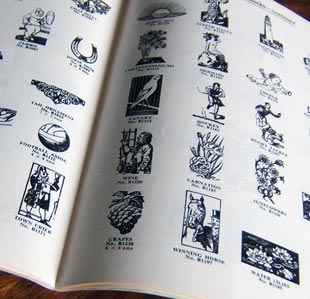
Adana’s Selection of Stock Blocks You might be lucky enough to acquire type during your letterpress career-local printers closing down, perhaps some comes with the press you’ve found, or perhaps from other hobby printers.
There’s some advice for you here — second-hand type can be a blessing and a curse. Remember that our current, UK founders are only in business while demand exists so you should use them while they are still around. There’s truth in the claim that your printing will be better with new type. Letterpress Alive lists the UK founders still in business.
Remember also that type — being predominantly lead — has a scrap value. While it’s not as valuable as pure lead it does command high prices. If you are looking for type you are competing with the scrap man.
Looking for Type
Places to look are –
- Local printers might direct you to letterpress shops closing down
- Small Ads in the BPSs Small Printer Magazine
- eBay occasionally lists printers who are loooking to get rid of their letterpress outfits
The type will mostly be available in jobbing cases — these can take up a lot of room, so bear in mind how you will store them in your own shop.
Buyers’ Guide
The quality of the type will depend on the way the shop was run. Some places know that they will not use lead type again and so do not distribute it back once a printing job is complete. This leaves cases with gaps in the most common characters. Some compositors take a more personal view — that the type should not be used by hobby printers — and so remove all of a given character to prevent re-use.
- Type Synopsis: how complete does the case look? Are there gaps in some letters? Have a look at a low-quantity compartment (like q, z or x) and see if there are enough of those characters
- Quality of the Type: is the type worn? Does it look free of corrosion? Has it been placed back in the case or thrown?
- Cleanliness of the whole thing: is the case and contents dirty? Is it covered in dust or ink? In some ways, well-used type is protected against corrosion. It might also mean that you have to clean it up before use
If you have type to dispose of, please look at disposing of equipment
Alignment: Important!
When type was cast by a traditional foundry, like Stephenson, Blake, they maintained alignments between castings. Each piece of type was a certain size and crucually, the alignment of the character on the type was consistent. This meant you could buy, say Modern No. 20 from them in 1905, mix it with type cast from 1950 and the two would look correct sat next to each other.
When printers began to use Monotype (and smaller founders used the system, too) there was a much larger number of people casting type, and each could have their own variations. One key difference from foundry type was that Monotype could be aligned on the body just as the founder wanted. This means that different castings of 12pt Gill Sans will always have a body of 12pt, and will always have the same design, but the characters may not line up because the character is not positioned in the same place on the body.
For this reason, you should not mix different Monotype founts (except where they are from a recognised founder). If you do, you will find that some characters ‘jump’ around the line reflecting the different castings of type.
Inspiration and much of the content of this article comes from J. Stafford-Baker of the Happy Dragons Press
-

Type Founders
Creating printing types is a precision job. This section give information about the firms that made type in the UK and also the systems available designed for printers to cast their own type.
I’ve scant information on these type founders. If you can supply more information or can name further founders, please contact me
Current Type Founders
If you’re looking for new type in the UK, keep an eye on Letterpress Alive. Key, current, UK founders are-
- Gloucester Typesetting, Stonehouse, Gloucestershire
- Supertype, Gomersal, West Yorkshire
- Ed Denovan working as Letterpress Works
- Whittinton Press/Nomad Letterpress have listed type for sale
Addresses and contact details at Letterpress Alive
Acorntype
John Eickhoff of Bristol cast type initially in a dedicated unit and then at home until 2005 under the name Acorntype. John’s focus was on small printers and his basic synopsis was 5A10a. John used Monotype machines to cast, and produced wonderful specimen booklets and broadsheets.
Miller and Richard
Miller and Richard displayed in their Victorian literature that they were ‘Letter Founders to Her Majesty of Scotland’. The firm was based in Nicholson Street, Edinburgh and was started by William Miller in 1809. Walter Richard joined in 1825 and the name for the firm was changed in 1838 to Miller and Richard. During the 1840s an ‘Old Style’ was cut for the firm and became the original ‘Scotch Roman’, a style which shaped many subsequent designs. In 1951 the firm closed and the designs passed to Stephenson, Blake. SB attempted to re-cast the ‘Old Style’ but were unable to do so because of the incompatibility between M&R machines and SB machines.
Mouldtype
Mouldtype used Monotype casting machines to cast type. The firm was last based in Dunkirk Lane, Preston, Lancashire. It seems to have closed around 1992 and the machines went to a museum in Japan. Type cast by Mouldtype has the letters ‘MTF’ cast on the shank.
Qualitype
Qualitype appear to have traded from Vicarage Place, Walsall, and cast a ‘Q’ in the shank of their types suggesting they cast their own type rather than simply distributing type from other founders. By January 1982 they appeared to have been taken over by Keyset Spools (Walsall) Ltd retaining a Mr C R Avery and still offering to cast card founts.
Riscatype
In 1878 Thomas Yendall took over a printing business started by John Taylor eight years earlier. The firm became a limited company in 1911. By 1925 type casting had started under the name ‘Riscatype’. Ten years later printing stopped and Yendall concentrated on the manufacture of type. In 1984 Yendall and Co. went into voluntary liquidation.
The firm had cast type using Monotype machines, housed in a cramped green metal building in Risca, South Wales. Mr Williams — at one time an apprentice at Riscatype — let me know that theirs was one of the largest foundries in the world with 11 Monotype Supercasters and 20 Monotype Composition casters. Only Mouldtype could match their quality.
Startype
Starytype based in Birstall, West Yorkshire used Monotype machines to cast type and advertised that they were contractors to HM Government and Overseas Governments. The casting machines were modified to work at higher temperatures with a different mix of type metal meaning that they could produce type suitable for hot foil work on a composition caster. The firm closed in the late 1980s.
Some machines and the expertise continue with Brian Horsfall who casts type under the name Supertype.
Stevens, Shanks & Sons Ltd
Stevens, Shanks & Sons Ltd was based in Southwark, London SE1. During the 1950s they used Monotype equipment, with a modified heating unit and harder alloy to make their type more hard-wearing.
In 1971 they moved from 89 Southwark Street to 22 Coleman Fields where they continued to cast type until the mid-1980s.
They revived some very old faces, and held some ancient founders matrices. They did not use Monotype Thompson Casters for this work, so must have modified the matrix holders on standard Monotype machines.
-

Type Synopses
A type synopsis is a way of describing how many of each character a complete set — or ‘fount’ — of type contains. When founders sold type on a great scale, type was sold by weight and older catalogues show how much type would cost depending on the weight of the fount.
It’s a fascinating area — how is it possible for type founders to judge the right proportions of words needed to fulfill the needs of printers? Different synopses were adopted for different purposes (like titling or display type; and ‘book work’) and from different foundries at different times.
There are some subtleties also: some founders would alter proportions to fit their casting machinery. Hence why some founts arrive that are not in alphabetical order. Others would swap out some characters to give the impression of a bigger fount.
John Southward’s Practical Printing of 1905 includes a footnote to say –
“There is a tradition in the oldest English type-foundry-the Caslon, in Chiswell Street, London-that the bill [of type] originated in a labourious and elaborate calculation of the number of letters used in setting a lengthy debate in the House of Commons, where is was supposed the best and most comprehensive English would be spoken”
This page shows some UK synopses: from Adana (who specialised in the smaller printer); Startype (a larger commercial foundry); and Miller and Richard’s Wood Letter Fount.
These apply to the English language only. Adana noted in their price lists that some overseas agents had adopted different synopses. Even with the UK, Startype supplied their customers in Wales with founts having fewer j, k, q and xs
Once you have your founts worked out, you’ll need to know where to put them in the case. David Bolton’s site of Type Cases shows both the cases and the different ways of organising the space.
As ever, any additions are welcome
Adana
Adana published two founting schemes: one for titling and caps only founts; and another for book work.
Scheme Adana offered this scheme in founts of… Smaller sizes Larger sizes 2A 4a 48pt 3A 4a 36pt, 30pt 3A 6a 24pt, 18pt 4A 9a 14pt 36pt, 30pt 5A 12a 12pt, 10pt 24pt 6A 18a 18pt 8A 35a 14pt, 12pt 10A 48a 10pt Book Work
Founted like this -
UPPER CASE LOWER CASE Character A2 A3 A4 A5 A6 A7 A8 A10 Character a3 a4 a6 a9 a12 a18 a35 a48 A 2 3 4 5 6 7 8 10 a 3 4 6 9 12 18 35 48 B 2 2 3 3 4 5 5 6 b 2 2 3 4 5 7 14 20 C 2 2 3 4 4 5 5 7 c 2 3 4 4 7 10 19 27 D 2 2 3 3 4 5 5 7 d 2 3 4 6 8 11 21 30 E 3 4 5 6 7 8 10 12 e 4 5 8 12 16 24 47 64 F 2 2 3 3 4 5 5 6 f 2 2 3 4 5 7 14 20 G 2 2 3 3 4 5 5 6 g 2 2 3 4 5 7 14 20 H 2 2 3 3 4 5 5 7 h 2 3 4 6 8 12 24 32 I 2 3 4 5 6 7 8 10 i 3 4 6 9 12 18 35 48 J 1 1 2 2 3 3 3 4 j 1 2 2 3 4 5 9 12 K 1 1 2 3 3 3 3 4 k 1 2 2 3 4 5 9 12 L 2 2 3 4 4 5 6 8 l 2 3 4 6 8 12 24 32 M 2 2 3 4 4 5 6 8 m 2 2 4 6 7 10 19 27 N 2 3 4 5 6 7 8 10 n 3 4 6 9 12 18 35 48 O 2 3 4 5 6 7 8 10 o 3 4 6 9 12 18 35 48 P 2 2 3 3 4 5 6 8 p 2 2 3 4 5 7 14 20 Q 1 1 1 1 1 2 2 3 q 1 1 2 3 3 4 6 8 R 2 3 4 5 6 7 8 10 r 3 4 6 9 12 18 35 48 S 2 3 4 5 6 7 8 10 s 3 4 6 9 12 18 35 48 T 2 3 4 5 6 7 8 10 t 3 4 6 9 12 18 35 48 U 1 2 3 4 5 5 5 7 u 2 2 4 6 7 10 19 27 V 1 1 2 3 3 4 4 6 v 1 2 2 3 4 5 9 12 W 2 2 3 4 4 5 5 6 w 2 2 3 4 5 7 14 20 X 1 1 1 1 2 3 3 4 x 1 1 2 3 3 4 6 8 Y 2 2 3 3 4 4 4 6 y 2 2 3 4 5 7 14 20 Z 1 1 1 1 1 2 2 3 z 1 1 2 3 3 4 6 8 & 1 1 1 1 2 2 3 3 � 1 1 1 1 1 1 1 2 � 0 1 1 1 1 1 2 2 � 1 1 1 1 1 1 1 2 � 0 1 1 1 1 1 2 2 fi 1 1 1 1 1 2 3 4 $ 0 1 1 1 1 2 2 2 fl 1 1 1 1 1 2 3 4 � 1 1 1 1 1 2 2 2 ff 1 1 1 1 1 2 3 4 1 2 2 3 3 3 4 4 5 ffi 1 1 1 1 1 2 3 3 2 1 1 2 2 2 3 3 4 ffl 1 1 1 1 1 2 3 3 3 1 1 2 2 2 3 3 4 4 1 1 2 2 2 3 3 4 5 1 1 2 2 2 3 3 4 6 1 1 2 2 2 3 3 4 7 1 1 2 2 2 3 3 4 8 1 1 2 2 2 3 3 4 9 1 1 2 2 2 3 3 4 0 2 2 3 3 3 4 4 5 . 2 3 5 7 9 12 14 16 , 3 3 5 7 9 12 14 16 - 1 1 2 2 2 3 3 4 : 1 1 1 2 2 2 2 3 ; 1 1 1 2 2 2 2 3 ! 2 2 2 3 3 3 3 4 ? 1 1 1 2 2 2 2 2 ’ 1 2 2 2 2 3 3 4 Titling and Caps Only Founts
Character A2 A3 A4 A6 A8 A12 A20 A24 A 2 3 4 6 8 12 20 24 B 2 2 2 3 3 5 8 10 C 2 2 3 4 5 8 13 17 D 2 2 2 4 5 7 11 13 E 3 4 5 8 10 14 24 30 F 2 2 2 3 4 6 9 12 G 2 2 2 3 4 6 9 12 H 2 2 2 4 5 7 11 13 I 2 3 4 6 8 12 20 24 J 1 2 2 2 3 4 6 7 K 1 2 2 2 3 4 6 7 L 2 2 3 4 5 8 13 17 M 2 2 2 4 5 7 11 13 N 2 2 4 6 8 12 20 24 O 2 3 4 6 8 12 20 24 P 2 2 2 4 5 7 11 13 Q 1 1 1 2 2 3 4 5 R 2 3 4 6 8 12 20 24 S 2 3 4 6 8 12 20 24 T 2 3 4 6 8 12 20 24 U 2 2 2 4 5 7 11 13 V 1 2 2 2 3 4 6 7 W 2 2 2 3 3 5 8 10 X 1 1 1 2 2 3 3 4 Y 2 2 2 3 3 5 8 10 Z 1 1 1 2 2 3 3 4 & 1 1 1 1 1 2 3 3 AE - 1 1 1 1 1 1 2 OE - 1 1 1 1 1 1 2 $ - 1 1 1 1 1 2 2 ½ 1 1 1 1 1 1 2 2 1 2 2 3 3 3 4 7 10 2 1 1 2 2 2 3 6 8 3 1 1 2 2 2 3 6 8 4 1 1 2 2 2 3 6 8 5 1 1 2 2 2 3 6 8 6 1 1 2 2 2 3 6 8 7 1 1 2 2 2 3 6 8 8 1 1 2 2 2 3 6 8 9 1 1 2 2 2 3 6 8 0 2 2 3 3 3 5 9 12 . 3 3 3 4 5 8 16 20 , 3 3 3 4 5 8 16 20 - 1 1 1 2 2 2 5 6 ’ 1 1 2 2 2 3 6 10 : 1 1 1 1 1 2 4 5 ; 1 1 1 1 1 2 4 5 ! 1 1 2 2 2 3 6 7 ? 1 1 1 1 1 2 3 3 Miller and Richard
Miller and Richard offered wood letter as a ‘six dozen set’ in the following proportions-
Character Number Character Number A 3 R 3 B 2 S 3 C 3 T 3 D 2 U 3 E 4 V 1 F 2 W 2 G 2 X 1 H 2 Y 2 I 3 Z 1 J 2 ; 1 K 2 : 1 L 3 & 1 M 3 . 3 N 3 , 3 0 2 ’ 1 P 2 - 1 Q 1 ! 1 Curiously, they refer to the exclamation mark as ‘mark of admiration’.
Startype and Supertype
Startype of Birstall, West Yorkshire, supplied the following founts (weights are also included)-
Point Size Weight (kg) Synopsis Point Size Weight (kg) Synopsis 6 2.5 60A 120a 8 2.5 40A 80a 10 5 50A 100a 12 5 40A 80a 14 5 30A 60a 18 5 18A 36a 24 5 10A 20a 30 5 6A 12a 36 5 4A 8a 42 10 8A 16a 48 10 6A 12a 60 10 (cored) 4A 8a 72 10 (cored) 5A 5a All of their founts were made in proportion to Cap A, rather than stated tables. Percentages are-
A 100 F 50 K 40 P 50 U 70 B 50 G 50 L 75 Q 25 V 40 C 75 H 75 M 75 R 100 W 50 D 75 I 100 N 100 S 100 X & Z 25 E 125 J 40 O 100 T 50 Y 50 , 100 ’ 50 : 40 ! 20 - 50 . 100 ’ 50 ; 20 ? 20 Figs 1–0 50 Titling founts were made in the proportions above (along with book founts). This contrasts with Adana’s two schemes for titling and book work. Brian Horsfall tells me that the proportions above were devised over a long period based on experience. While Startype could have adopted a more scientific approach, it wasn’t possible without some sort of automation to check previous orders.
Acorntype
John Eickhoff’s Acorntype of Bristol took great pride in offering ‘card founts’ — type to a 5A10a synopsis. It is reproduced here –
A B C D E F G H I J K L M N O P Q R S T U V W X Y Z 5 3 4 3 6 3 3 3 5 2 2 4 3 5 5 3 1 5 5 5 3 2 2 1 2 1 a b c d e f g h i j k l m n o p q r s t u v w x y z 10 4 6 7 13 6 4 7 10 4 4 7 6 10 10 4 3 10 10 10 6 4 4 3 4 3 ½ & , . ; : - ’ ’ ! ? ( ) ff fi fl ffi ffl Figures 2 2 5 5 2 2 2 2 2 2 2 2 2 2 2 2 1 1 3 each of 0–9 Information other founders is always welcome, please get in touch.