
An account on Medium of designing the letter Æ.
Header Image By Szomjasrágó at Hungarian Wikipedia (Transferred from hu.wikipedia to Commons.) [CC0], via Wikimedia Commons
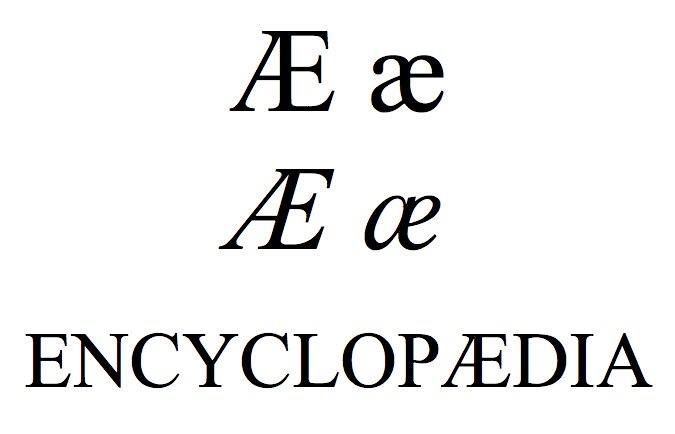
An account on Medium of designing the letter Æ.
Header Image By Szomjasrágó at Hungarian Wikipedia (Transferred from hu.wikipedia to Commons.) [CC0], via Wikimedia Commons
Igino Marini’s website about the Fell Types, including downloadable versions of the types, via. Ian Knight.

An amazing project by Dave Hughes and John Cornelisse to scan the back copies of the Monotype Recorder. The Monotype Recorder both set the standard and documented the advance of typography at the hands of this firm and these PDFs will make fascinating reading. Thanks, both!

Greatly informative article on the history of the ‘commercial at’ or @ symbol by James Mosley.
In the letterpress world, the choice of typefaces was a very big consideration. Remember that today we can download new faces and use them immediately. In letterpress settling on one face meant a large outlay and physical space occupied by typecases and lead type. It was no simple matter to adopt a new house face once all that money had been spent.
Printers seldom had the opportunity to start afresh so this article is somewhat idealistic, but all printers were encouraged to have a system or a house approach to types. This article is based on a November 1957 article in Print in Britain, and is unusual because it wasn’t based on the self-interest of any one founder or composing supplier (like Monotype or Linotype). The article assumes a smaller printing works where there could not be an endless supply of space or capital to spend on type.
The first concern is around the class of work that the printer would undertake and we can classify our small printer in to one of three groups –
We also need to know whether the printer has chosen to be a Monotype house or a line-casting house (using a Linotype or an Intertype). The faces available on each of these systems was different.
The recommendation here is that because Times New Roman (Monotype Series 327) is so ubiquitous, it does need to be included but should not be first choice. An old face design like Imprint (101) might take the top slot in 9, 11 and 12pt. The Gill family (262) would come next considering the many variants that might be used within this family and the fact that it can be supplemented with display faces. Start with 6, 8, 10 and 12pt. Finally, Times New Roman should be bought in 8, 10 and 12pt with 6pt an option for small advertising work. The rule here (and for all other faces) is to get italic, then small caps, then bold if needed.
The emphasis here is on the professional approach and so the choice of faces changes slightly. Knowing that this work is to produce more lasting items (like brochures) rather than the throw-away circular the approach is a little more classic.
The recommendation is to use Baskerville (169) instead of Imprint (in sizes 8, 10, 12pt). Plantin (110) (in 8, 10 and 11pt) would be used in lieu of Times. Plantin is recommended because of its ‘august’ appearance when well-leaded and its economy of space when needed.
Gill is used again for the sans serif face.
The Class C printer will also need to be able to tackle some book work, and we recommend Bembo (270) in 10, 12 and 14pt to supplement the Class B list. One word of caution here, the italics and small caps will be critical in this work so need to be seen as integral with the purchase of the roman. Bold might be bought at a later stage. This printer might also buy Times New Roman as a fifth choice.
With a slightly more limited range of faces, there is perhaps less scope to discuss the various combinations. One consideration is the faces to be duplexed that’s to say which two faces should appear on each matrix. Some faces had no related bold so a bold from a similar face had to be supplied. For most work the italic (rather than the bold) was best to be duplexed with the roman.
This printer would keep Metroblack as the sans serif but use some more traditional faces:
With a fourth face of Pilgrim (10 and 12pt) and a fifth for book work of Minerva (8, 10, 12pt).
Types larger than 14pt are classed as display types and are usually used for headings rather than body text. The choices here expand depending on the house.
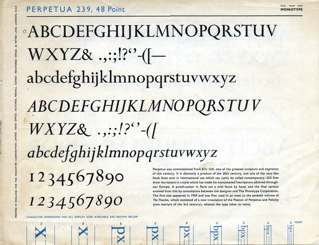
The Class A printer is recommended to get the companion display sizes for his basic selection: so Gill and Times in display sizes. Spreading further Headline Bold (595) or Perpetua Titling (258) might be used.
The Class B printer might use Albertus (481) and maybe Rockwell Bold (391).
Printers in Class C will need Perpetua for headlines, chapter openings and dropped capitals in book work.
For all of these groups, a useful script would be Klang (593); but this will need to be contrasted with the rest of the piece.
Again, we have the issue around a more limited number of faces. Some faces also had variants or sizes missing in the series. For the Class A printer, Century Bold, Metromedium and Granjon should be used, with Pabst Extra Bold as a fourth choice. Class B printer should use Memphis Bold, Plantin and Times New Roman. Printer C should use Minerva Bold and Scotch Roman No. 2.
Because line casting houses typically included a Ludlow machine, Ludlow faces in sizes 36 to 72 should be reviewed: Tempo Heavy, Bodoni Bold, Franklin Gothic, Caslon and Garamond are candidates.
Regardless of the house approach to typesetting, some more exotic types could be employed that have been bought from typefounders. This list should be strictly limited, though, considering the expense and space that these less-used faces would need.
From Stephenson, Blake the recommendations are: Grotesque No. 9 and italic; Chisel, Old Face Open and Franchesca Ronde; along with an antique face like Consort (or Antiques No. 3 and No. 6 from Stevens, Shanks).
Continental founders’ might supply Mistral, Sapphire Initials, Studio, Holla, Paris Weiss and Stop.

From the 1920s, Monotype took the challenge of improving typography very seriously and embarked on a programme of developing new faces and reviving classic faces so that the world might be rid of faces like Cheltenham. Intertype and Linotype were slow to follow and concentrated on speed of production rather than quality. My view is that Ludlow took typography seriously, but their smaller market share meant they didn’t have the same impact.
The system itself had some advantages as well as the italics (mentioned below), the same degree of control was available over spacing as in hand composition. Contrast this with linecasters using adjustable spaces that sometimes led to rivers of spaces following through work.
The name R. Hunter Middleton is synonymous with the Ludlow Corporation, and he designed some of the firm’s most successful faces including Deplhian Titling, Tempo (sans serif), Karnak (slab serif), and a Garamond
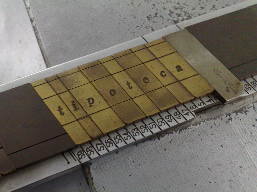
Because of the simplicity of the Ludlow system, they could make amendments to the operation of the machine relatively easily. Once such change was to introduce italic matrices, and a special italic stick. A difficult problem for line-casting is that italics have a tendency to encroach on the area of the preceding and following letters: take the f for example, which will hang under the earlier character and over the following. Because most other casting uses rectangular mats, this cannot easily be accounted for and so the face has to be adjusted and weakened to fit within the confines of the mat. In 1913 Ludlow decided to go with the italic wholeheartedly and developed matrices that slope at a 17° angle and are held in a stick with ends at the same angle. The result is that an f, for example, can be cast at that angle and fit neatly with the other types at the same angle. By means of triangular spaces, roman and italics can mix on the same line.
Ludlow took full advantage of this and developed some beautiful italics to go with their faces.
Knowing that they were keen to attract the jobbing printer, Ludlow set out to make the printing of ruled formes very easy. Jobbing printers had to produce invoices, bills, account sheets and so on, and traditionally had used metal rules sat between lead types to create the right pattern. This approach tied up material and took a vast amount of time: imagine setting multiple horizontal and vertical rules with some type to create a petrol station receipt, for example.
Mr Merrill of Ludlow developed Ruleform in 1923. The approach was to create uniform-width matrices and exploit the slug by casting overhangs and underhangs at the top and bottom of the same slug. Using the repeat casting function meant that one line could be set and duplicated, and the underhangs and overhangs would mesh with each other to create a whole, solid lump for printing.
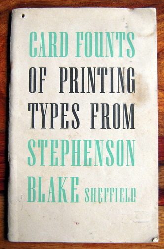
This article is about the traditional type-founding activities of Stephenson, Blake. In late 2005 Thomas Blake sold the original site and a new firm, Stephenson and Blake Limited, continue the brass rule and other brass products from Effingham Road, Sheffield
The now defunct, but still famous name of Stephenson, Blake (SB) was created when James Blake and John Stephenson signed a partnership agreement on 25 September 1830 to last until 1840. The agreement was renewed, and the name persisted, absorbing many other type foundries in the intervening years. The foundry had always been based around Upper Allen Street in Sheffield
The foundry had been in Sheffield in one form or another since around 1797 when a local bookseller (John Slater) and a bookseller-printer (William Bower) joined forces with a printer (Clay Bacon) to cast type, issuing their first specimen in 1809. That founding work had persisted under many names until taken on by Garnett and Blake, and then becoming Stephenson, Blake.
Since the earliest times SB had worked to 1/5000th of an inch as a matter of course: the type they founded was considered the most precise in the UK.
A London warehouse was opened in 1865 to supply the demands of Fleet Street newspapers. Business was so good that they removed to larger London premises on Aldersgate Street in 1871.
The next major change was the move to the American Point system which had been adopted by America in 1886. Some firms in the UK were quick to adopt this change-like Caxton in 1895-it was a further four years before SB renewed their moulds and matrices to work on the point system. A key advantage for customers was that type and spacing was now interchangeable between suppliers: printers having a uniform system to measure size.
A rival founder, London-based Charles Reed and Sons hit financial difficulties and was sold in 1905 to Stephenson, Blake who offered £5,000 for the foundry, matrices and the 82 tons of stock. The purchase was effective from 1 January 1906 and the firm was known for a time as ‘Stephenson, Blake and Company and Sir Charles Reed and Sons’. The work of the Reed foundry and some equipment was shipped to Sheffield where an almost self-contained foundry existed alongside the SB equipment.
In January 1907 a Woodworking Department was established over the road from the foundry to make furniture for composing rooms and type cases. A year later the production of wood letter was brought in-house and examples first appeared in the specimen books of 1910.
All type founders were affected by the Great War of 1914–1918 and this led to further rationalisation in the industry. Discussions began with H W Caslon about an amalgamation, but this did not reach a successful conclusion at this time. Caslon’s factory had been used to manufacture items needed for war, and this provided financial help to take them out of the financial problems. Building on this, Caslon issued a booklet called Two Centuries of Type Founding which the wider industry admired.
Stephenson, Blake reacted by engaging Robert Fishenden to produce the most ambitious specimen book ever devised. Seven hundred pages were hand-set in London, shipped to Stephenson Blake and then to West Street where the printer‑J W Northend Ltd-had the task of taking proofs. These were inspected by H K Stephenson and R G Blake before being committed to print on two hand fed quad-demy Miehle machines. The quality of the result was highlighted when the book was reviewed by the Times Educational Supplement. J W Northend was told that SB would take their business elsewhere if they moved to mechanical composition, and Northend resisted this until the 1970s.
In 1936 SBs main competitor‑H W Caslon-had again met financial difficulties and went in to voluntary liquidation. Stephenson, Blake bought the goodwill, assets and punches of Caslon, and retained the name by calling their Sheffield premises The Caslon Letter Foundry.
World War II had a great effect on the foundry: not only because many men were called up, but air raids disrupted the business. In December 1940 air raids meant that gas, electricity and water were lost to the foundry in Sheffield. R G Blake had ensured that casting machines were ready for work at his home, and these were used for casting until mains services returned in January 1942.
Post 1950 the Woodworking Department had expanded to provide a full service to composing rooms and many prestigious orders were executed including the Sunday Times’ composing room in 1973.
Following the trends of the industry Stephenson, Blake found it difficult to remain a letterpress business in face of competition from litho machines. They diversified by offering the ‘Letterphot’ system of photo typesetting; and turning the wood operations to the manufacture of precision instrument cases. The firm’s precision engineering team was used by Rolls-Royce Olympus to produce moulds for parts for Concorde.
The firm found it difficult to pay business rates on the sprawling collection of buildings around Upper Allen street and began to divest themselves of them, including knocking some down. Re-location was considered to Derbyshire to avoid this overhead.
Just before 2000 the firm sold its non-printing businesses and Thomas James Blake looked to re-launch the firm. For a time the firm remained producing related items for the non-printing market: brass rule for plastics firms; Mazak type for hot-foiling and cabinet making for museums. The collection of historical matrices and punches went to the Type Museum in London with assistance from the Science Museum.
By December 2004 this final element of the business had ceased, although the firm’s website ran until March 2005. The site is currently being re-developed with the historical building being turned to flats. The scheme will be called Impact after SBs 1965 face designed by Geoffrey Lee.
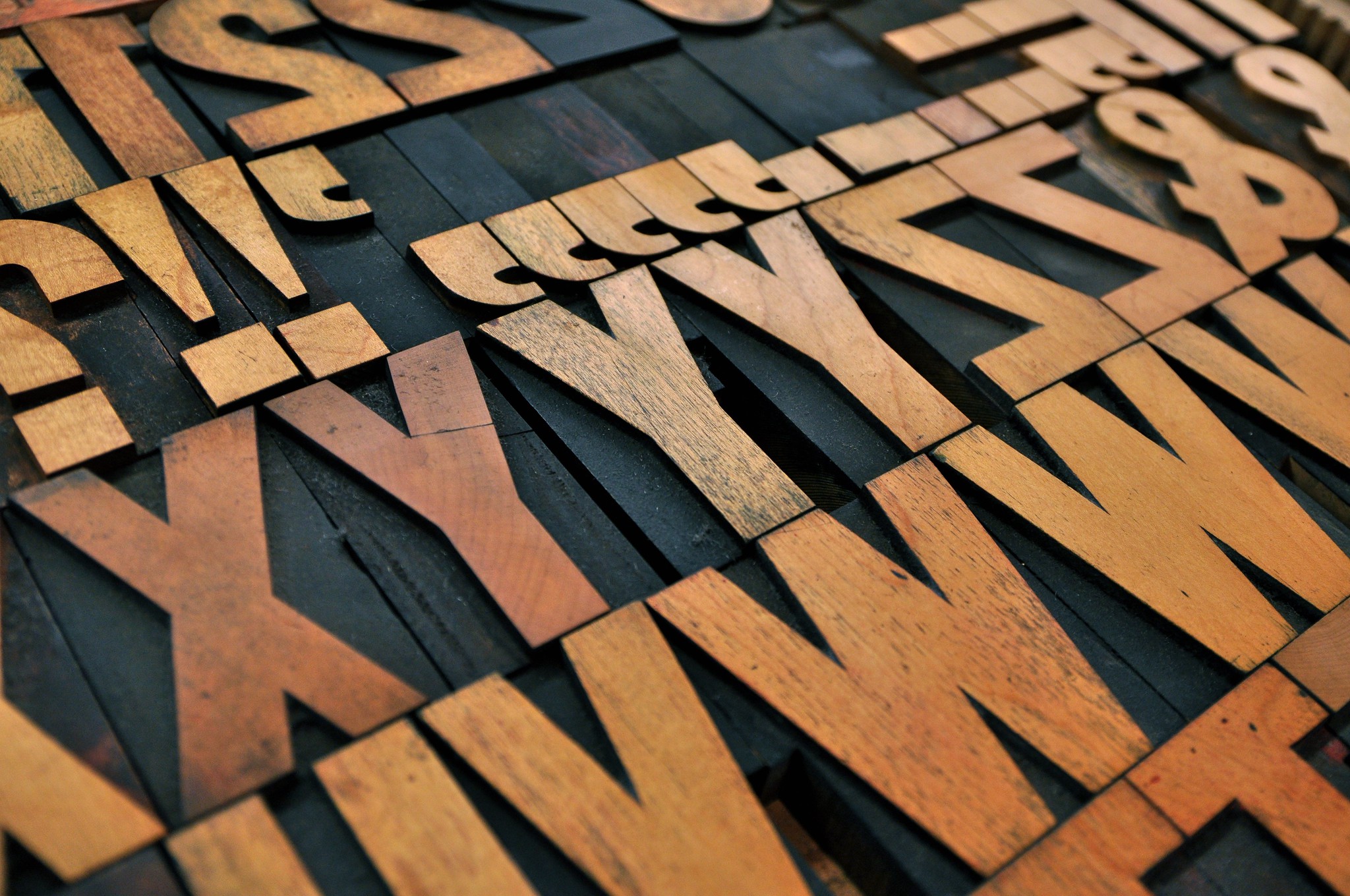
Letterpress printing depends on a raised image, it’s known as a relief process. Movable type was the breakthrough that allowed printers to use and re-use individual characters. When you practice letterpress printing it’s easy to forget just how difficult it must be for type founders to create tiny pieces of cast metal hard enough to withstand a tremendous force that are made to tolerances of less than one thousandth of an inch.
Gutenberg of Germany is credited with the invention of moveable type around 1450; but records show that both Chinese and Korean inventors had used the idea before the time. Gutenberg’s invention was the first to be exploited and the idea spread rapidly. There are three key stages in founding type –
Type founding is a specialist industry needing artistic and design skills in equal measure with engineering prowess and ability to work in some of the very heavy aspects of industry. The industry was centred around the demand in Fleet Street, London; but other significant type founders worked where technical expertise was greatest-for example Stephenson, Blake of Sheffield.
The key constraint for printers was that type from a foundry had to be assembled by hand before printing could begin. This composition activity took a great deal of time and tied up capital in the type needed. As the 19th century grew to a close people we very keen to automate this part of the process-work began to look at producing type in the order it was needed. That’s to say go directly from the copy to the metal type with no sorting or composing process in between.
There became two families of type: foundry type (generally harder quality) that was produced in the great foundries; and composition type (slightly softer quality) that was produced from copy either by a specialist firm, or even by the printer himself.
The UK had a number of very influential foundries. While early metal type from the continent (in particular Dutch type) was considered superior, the UK caught up and great names like Caslon, Figgins and Stephenson, Blake were established. The large number of small foundries gave way to a smaller number of large foundries. The last of the English Foundries, Stephenson, Blake of Sheffield stopped trading in December 2004. That foundry alone had acquired Charles Reed and Sons in 1905, and H. W. Caslon and Co in 1937.
Allowing printers to cast their own type was a key driver behind developments in composition type. There were two broad approaches: build a complete line of type from a machine; or build individual characters in the correct order from the machine.
Linotype and Intertype took a similar approach: the operator sat at a keyboard and typed the copy. While copy was being typed the matrices (type moulds) were assembled within the machine. Once a line was completed the moulds were filled with hot type metal and the resulting ‘slug’ was forced from the machine, being trimmed and shaped in the process. The Ludlow Typograph was similar, but the matrices were assembled by hand.
Monotype adopted a different tack. They split the operation between keying the copy and casting the type. Copy was typed on a Monotype Keyboard powered by compressed air which punched holes in a paper tape. The tape was then taken to a casting machine which used the paper tape to position a case of matrices and cast a single piece of type for each keystroke on the paper tape. The advantage of this approach was to allow for correction after composition had been produced by the machine.
In modern times, Monotype machines can be controlled by computer–allowing the direct production of metal type from a computer keyboard.

The clever invention, just too late to make a difference to letterpress’ demise, but that keeps some printers happy today
A starting point for the age-old problem of choosing a house face

How did we in the English-speaking world arrive at 0.01387” as one point?

The obscure join between maths and printing — making sure each letter is in the right proportions

Other UK type founders
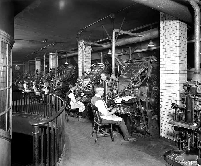
A guide — in note form — to salvaging a Intertype or Linotype

The system that spawned a great name in letterpress and the typography we use today

The less-popular brother of the Intertype/Linotype and the Monotype system

The machine used by smaller printers to cast new ‘strip material’

Bigger type to produce those wonderful inky letterpress posters
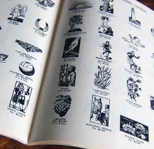
How to find and buy second-hand type
