
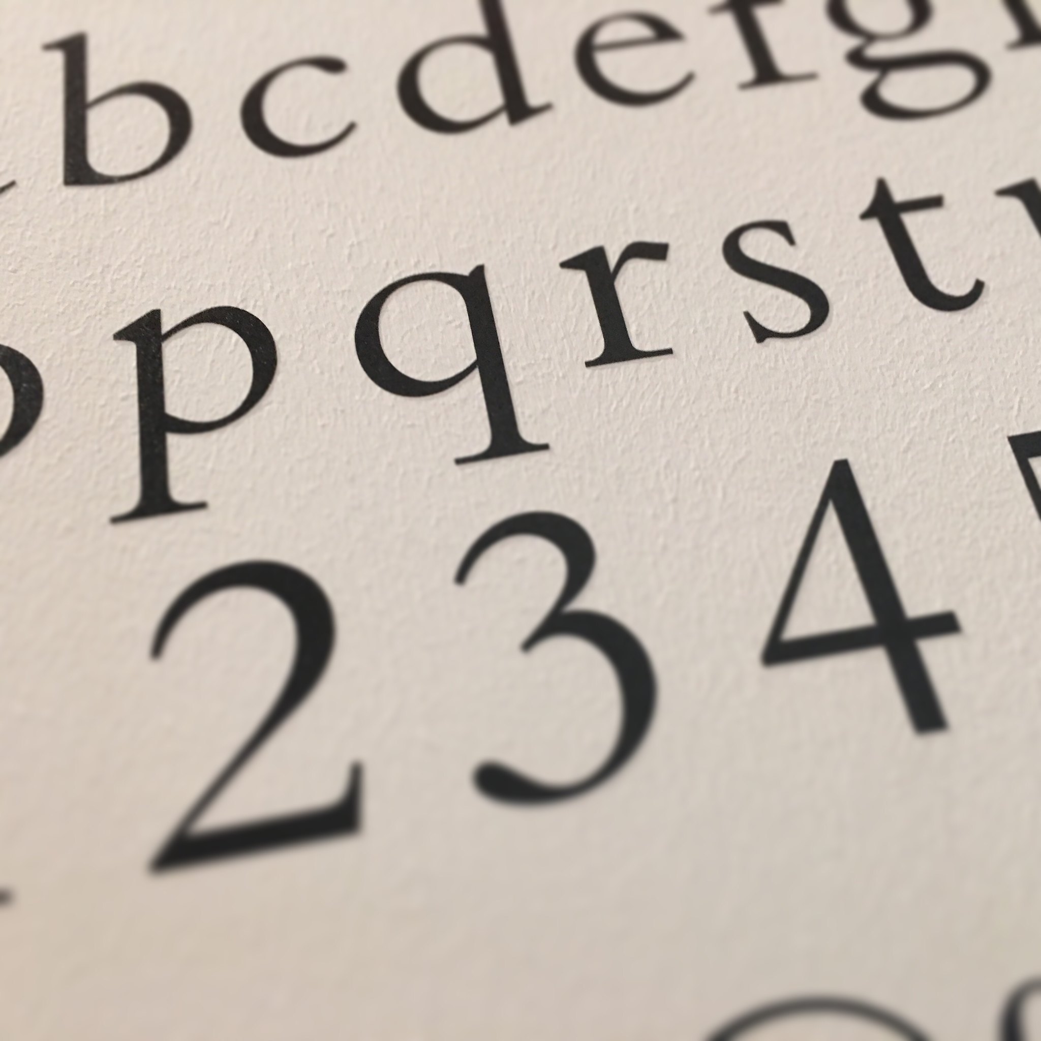
As a face, Bembo has that look that it’s been around forever. In fact it’s a 1929 face created by Monotype with impeccable credentials.
Monotype’s Work
Stanley Morison was attracted to 15th Century Italian printing, and corresponded with printer Giovanni Mardersteig. Other forces came together at the same time: a reaction away from the ‘modern’ faces that had been dominant in jobbing printing, improved casting processes through the Monotype system, and better printing surfaces.
…inspired not by writing, but by engraving; not script but sculpture.
Stanley Morison on Bembo Roman, quoted in a New York Times letter.
Bembo was reviewed in The Fleuron in 1930, commenting “It will be used by the ‘undistinguished’ as well as the distinguished printer, for it possesses all the virtues in an eminent degree; a first-class legibility in its own right, an Englishness conferred by our use of Caslon for two centuries, economy in a‑z space, adequate but not extravagant ascenders and descenders, agreeable variety thicks and thins, a perfect grace in combination and, above all, a due capacity for enlargement.”
This comment on ‘undistinguished’ printers probably relates to the overall popularity with small jobbing printers producing single-page work as well as book printers. Print In Britain recommended Bembo as a core face for what they called Class C Printers — those taking on multi-colour and more ambitious jobbing work.
Monotype’s work was painstaking, and the overall approach was to cut and trial selected characters making sure the overall impression was right before committing to the full set of characters for the matrix. A reference in the Journal of the Printing Historical Society (2001) suggests this was an iterative process and Monotype’s works in Surrey would re-make the punches over and over again until the results were satisfactory.
The companion italic to what was now Monotype Series 270 was initially designed by Alfred Fairbank, but it was found this italic did not harmonise well with the roman face. The eventual italic was based on the calligraphic writing of Tagliente.
Historical Basis
The face was initially cut by Francesco Griffo, a punchcutter — a key stage in creating type — from Bologna, Italy. This was used by the Venetian printer Aldus Manutius for a book by Pietro Bembo in 1495.
This model of a face was influential in France from the 1530s and acted as inspiration for punch cutters like Claude Garamond.
In Use
The 1948 exhibition ‘Fifty Books of the Year’ showed one in five were using Bembo, giving an indication of the appeal in book work.
In his Monotype Recorder article, Some Observations of a Small Printer, Will Carter suggested that two versatile families of type would be needed and commends Bembo as ‘…without question the finest roman of them all.’ This was supplemented by Walbaum and display faces.
There was a recommendation, too, that Bembo was a good face for foil blocking work: the basis of the type in sixteenth century printing means the design was intended for a heavier impression and consequent thickening of strokes on a blocked book cover.
Year and Era
1929 / Commercial
Object Type
Types and Casting
Location
Monotype Works is used: Salfords, Surrey
Sources and More Information
An Appeal
If you have something linked to this object, please get in touch.
Header Image: “Bembo typeface” by Speckled Jim is marked with CC BY-NC 2.0.